Work / App · Research
Scriptorium
Open
- ScriptoriumThe workbench on a computer. Write, compare, randomise and export.Run · soon
- MobileScriptorium for phones.Run · soon
- Weft & RadixThe type study, a single page on the two meaning scripts.Read · soon
About
Writing is a technology with many possible designs
Scriptorium is the experimental arm of the FONT project. It asks three questions. What would English look like if it borrowed the best tricks of other scripts? Can ideas be written directly? And what else could a script for English have been?
None of its scripts is a new language. Nothing here has its own words, grammar or pronunciation. They are writing systems: different ways of putting meaning on a page, each taking a mechanism that a real script invented.
Weft: English that carries context
The base is a clean, semi-joined Latin hand. Letters stay distinct, because reading research shows we read words through their individual letters. On top, optional layers put back some of what speech carries and plain text loses:
- determinatives, a small mark above the first letter saying what kind of thing a word is (a person, a place, a feeling), as Egyptian scribes did;
- logograms for about fourteen very common words, as in medieval abbreviations and shorthand;
- phrase-lines binding each noun phrase, like the Devanagari headline;
- a negation mark: not stays in the text, and a wave flags the word it negates;
- threads, cascade and prosody: related words linked, lines broken at clauses, weight following stress;
- a mixed mode where key concepts become Radix glyphs inline, with the English word in small type above, like kanji among kana with ruby.
It is still English. You could read it without the layers; they add signal, not a new code.
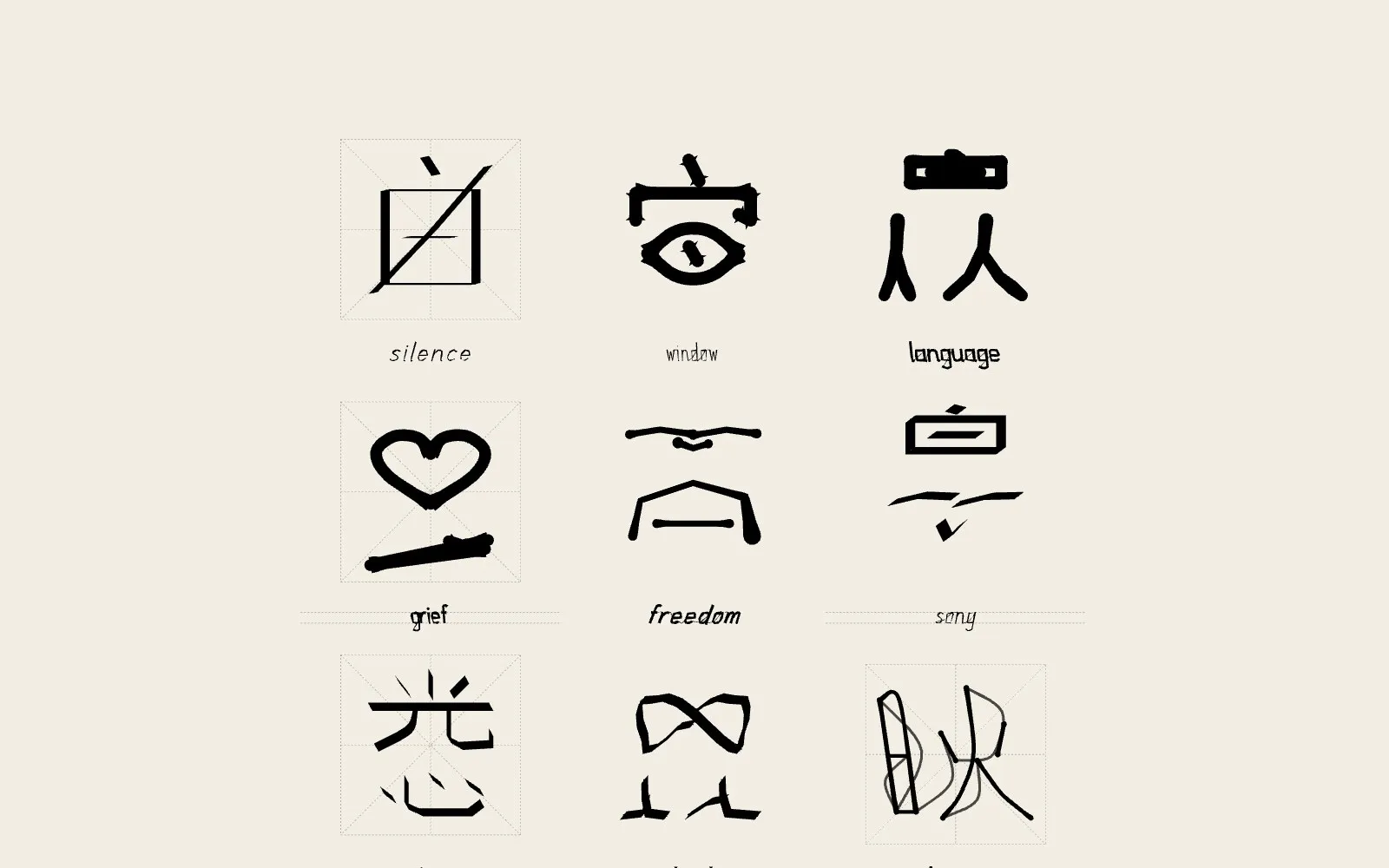
Radix: glyphs for ideas
A Radix glyph is a picture of a definition, built from 34 primitives (LIGHT,
MIND, PAST, FUTURE, PERSON, HOUSE, FEEL, SAY, NOT… and later MOON, STAR, MOUNTAIN,
ROAD, DOOR, SEED, BIRD, KNOT) arranged by position: A|B side by side (category,
then core), A/B stacked (quality over ground), A[B] enclosed (scope), A+B
overlaid (negation or tension), ~A mirrored (reversed direction).
So idea is LIGHT/MIND, memory MIND/PAST, forget (MIND/PAST)+NOT, and
nostalgia HOUSE[FEEL/PAST]. Because a glyph encodes meaning and not sound, a
French or a Japanese reader can read it as well as an English one, as with Chinese
characters and Blissymbolics. A left sweep means past and a right sweep future, so
right-to-left readers get a mirrored edition.
Invent: what else English could have been
Each seed invents a writing system for the English alphabet from a stroke grammar whose defaults are the regularities of real scripts: a bias toward horizontal and vertical strokes, strokes that meet in junctions, a budget of complexity. The system can be an alphabet, a Cree-style rotation (one shape turned four ways for four vowels), an abugida, Hangul-style blocks, a featural script whose shapes come from where the mouth makes each sound, Ogham, or Braille. It can also borrow Latin letters and give them new values, as Sequoyah did for Cherokee.
How a glyph is made
generator → skeleton → pen → outline → finish → SVG · PNG · OTFGenerators emit skeletons, never ink: centre-lines in the order and direction a hand would write them, each tagged with the gesture that made it, after the eight strokes of 永. Pens are physical models, not styles: a broad nib’s contrast comes from its angle, as it does on paper; a brush’s pressure from the gesture; a reed stylus presses wedges into clay. That is why randomising a pen gives plausible writing instead of noise. The finish is the surface: ink, bleed, grain, the ink-saving operators from the project’s study of printing, guides and an x-ray of the skeleton.
Everything is seeded, so the same settings always give the same glyphs. It takes its method from Persona: families with a fixed structure and exposed numbers, vary and reseed on keys, locks for what you want to keep.
The research
Every element points back to a document, and every claim in those documents carries a tag saying how well it is supported: verified at the source, established, secondary, hypothesis, or design decision. The notes cover ink and legibility, how letters and words are read, the world’s writing systems and the patterns they share, and the psychology of communication. The work is written up in the paper Writing the Live Set.
Used here
The typeface of this website is SVDK Weft: Scriptorium’s Weft alphabet, inked by its monoline pen and exported as a font. The project pages for this workbench use its broad-nib cut.
Features
- 01
Weft
Readable English in a single-stroke hand, with switchable layers of meaning drawn around the letters. Flowing, cascaded at clauses, on a Nastaliq slope or justified with kashida.
- 02
Radix
Ideographic glyphs built from 34 meaning primitives by a position grammar: side by side, stacked, enclosed, overlaid, mirrored. Seal, Kai and Grass registers.
- 03
Square
English words packed into square blocks, after Hangul and Xu Bing, flowing in rows, CJK columns, Mongolian columns or boustrophedon.
- 04
Invent
A new writing system for every seed: alphabet, Cree-style rotation, abugida, Hangul-style blocks, featural, Ogham, Braille. Generations hands it down from learner to learner.
- 05
Score
A graphic score for live-coded sets. Reads a whole crashDot set and draws one staff per player, or redraws it as a clock, a river, a spiral, a punch card, a weave or a patch.
- 06
Signal
Sound as writing: patch cables, oscilloscopes, visible speech from vowel formants, circuit boards, mixers, step sequencers, tape machines, radios.
- 07
Conduit
Cables and solids in 3D, shaded in ink from a movable light: harnesses, torus knots, still lifes, letters bent from cable, cable cities, planets.
- 08
Display
Poster typography from the Weft skeletons, outlined, inlined, extruded, hatched, knocked out, striped or perforated, word by word.
- 09
Graphic and Neural
Constructivist and op-art fields to set things against; and the nervous system in ink after Ramón y Cajal, down to a sentence drawn as a network of neurons.
Images
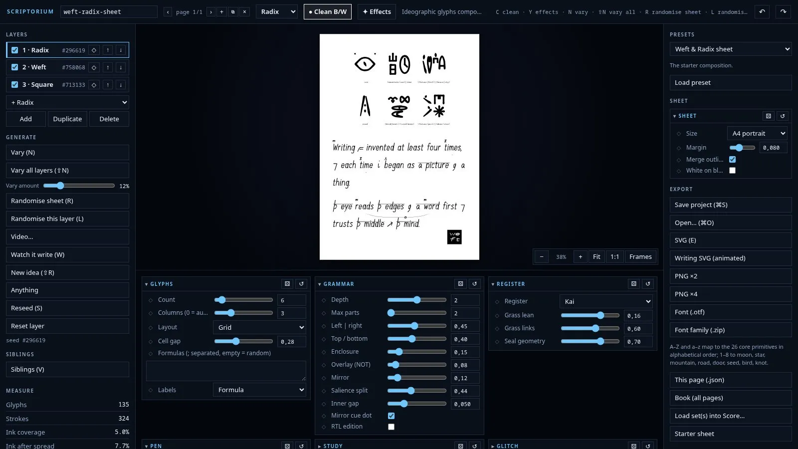
The workbench: layers, generators, pens and finishes around the sheet. 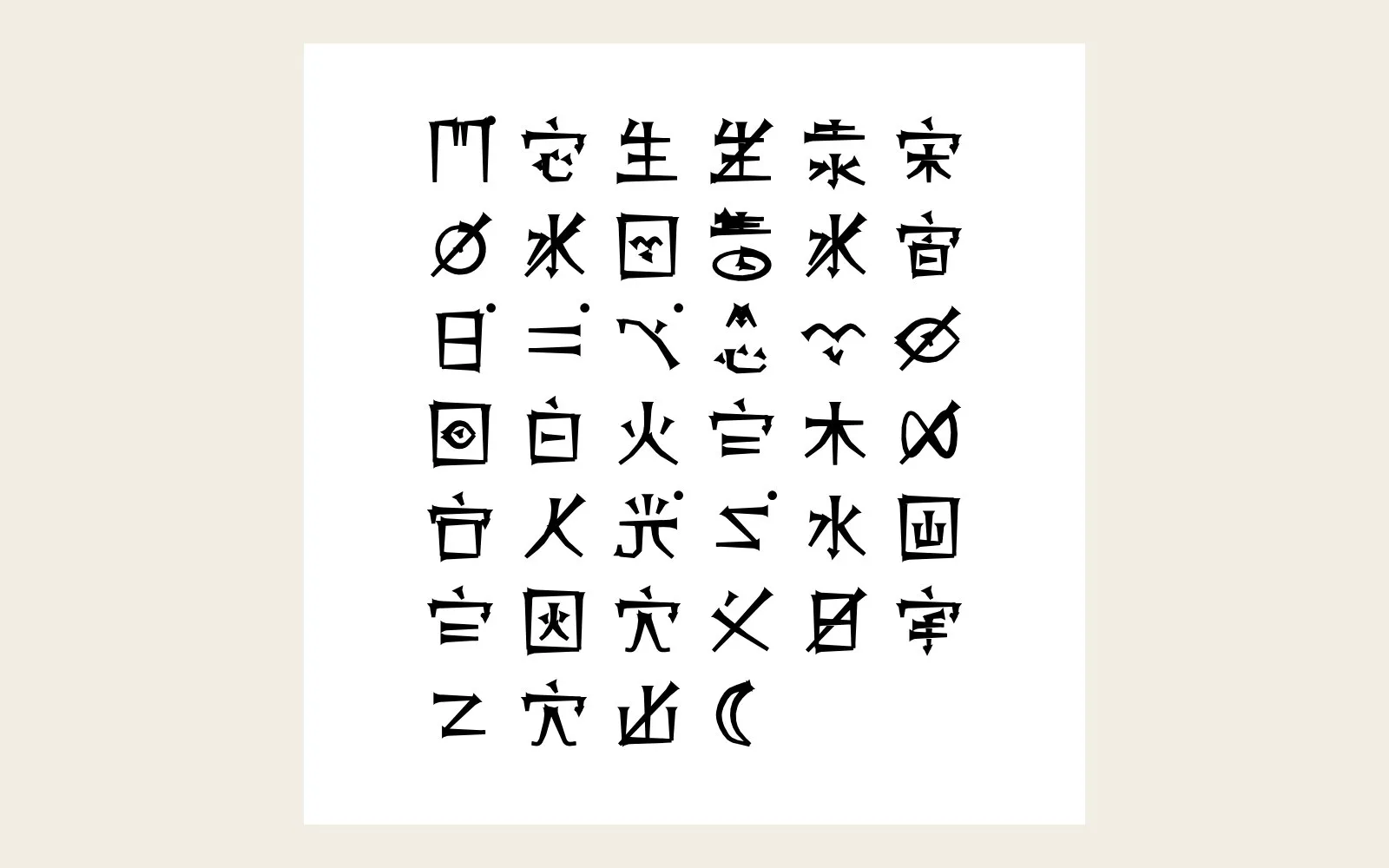
Radix field: glyphs composed from meaning primitives. 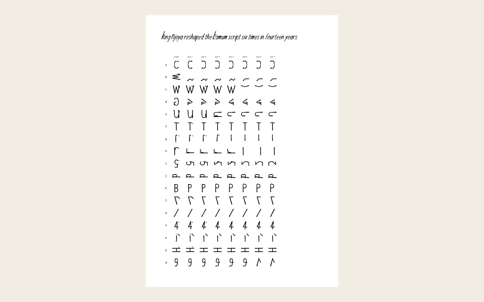
Generations: an invented script handed down learner to learner, simplifying as it goes. 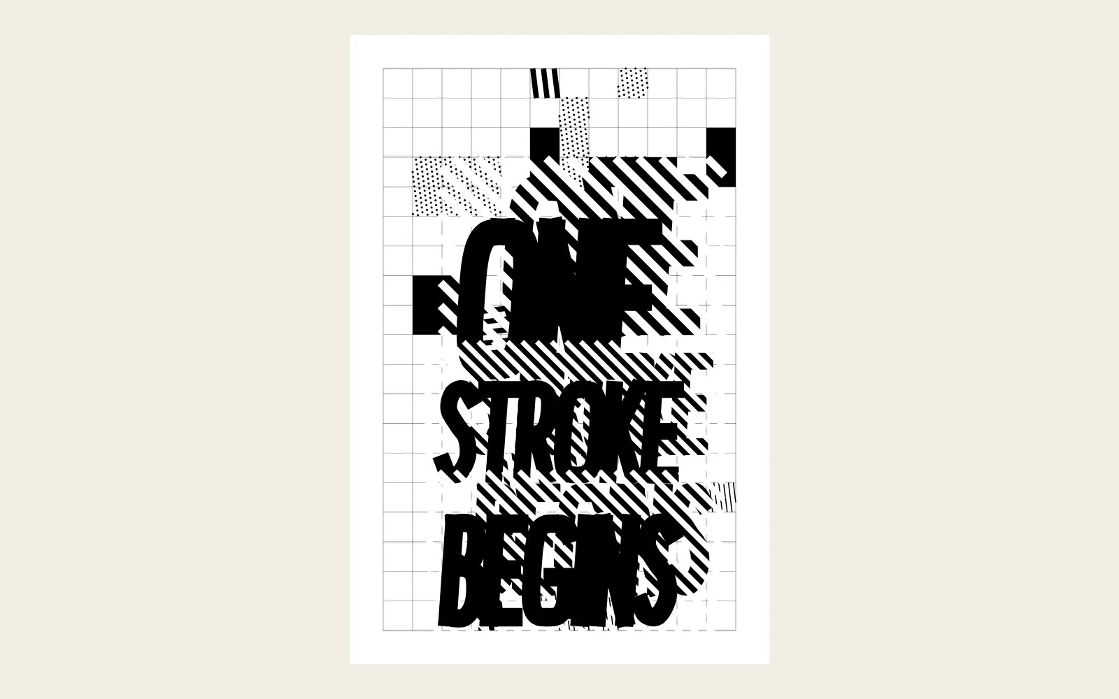
Display: a block-letter poster from the Weft skeletons. 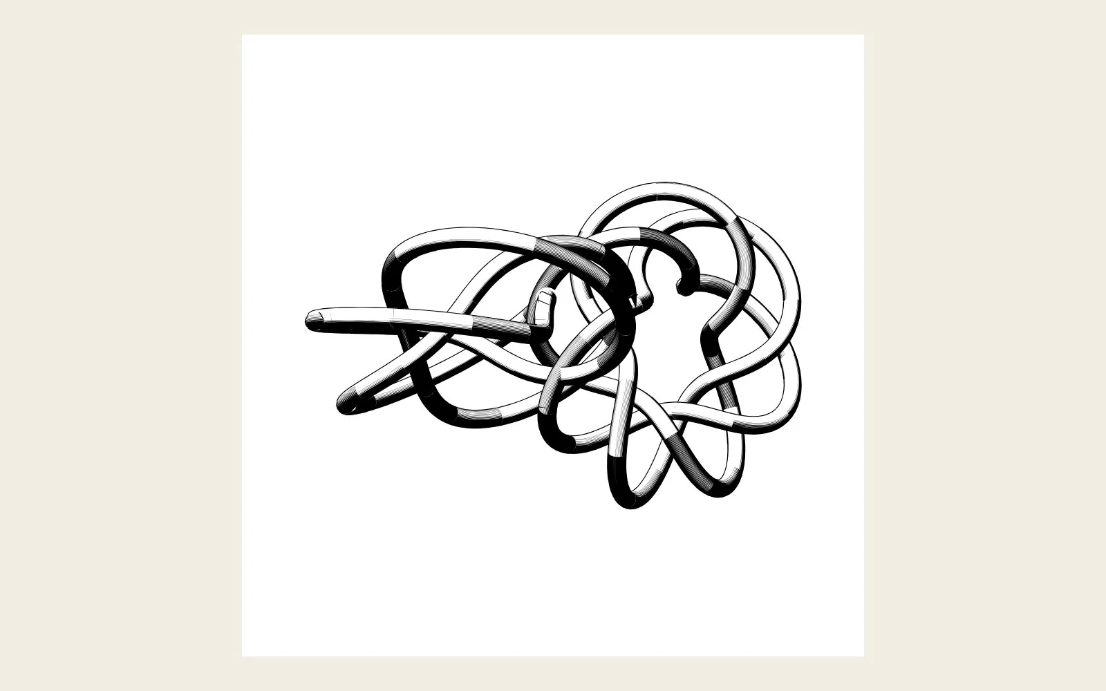
Conduit: a knot study in shaded ink. 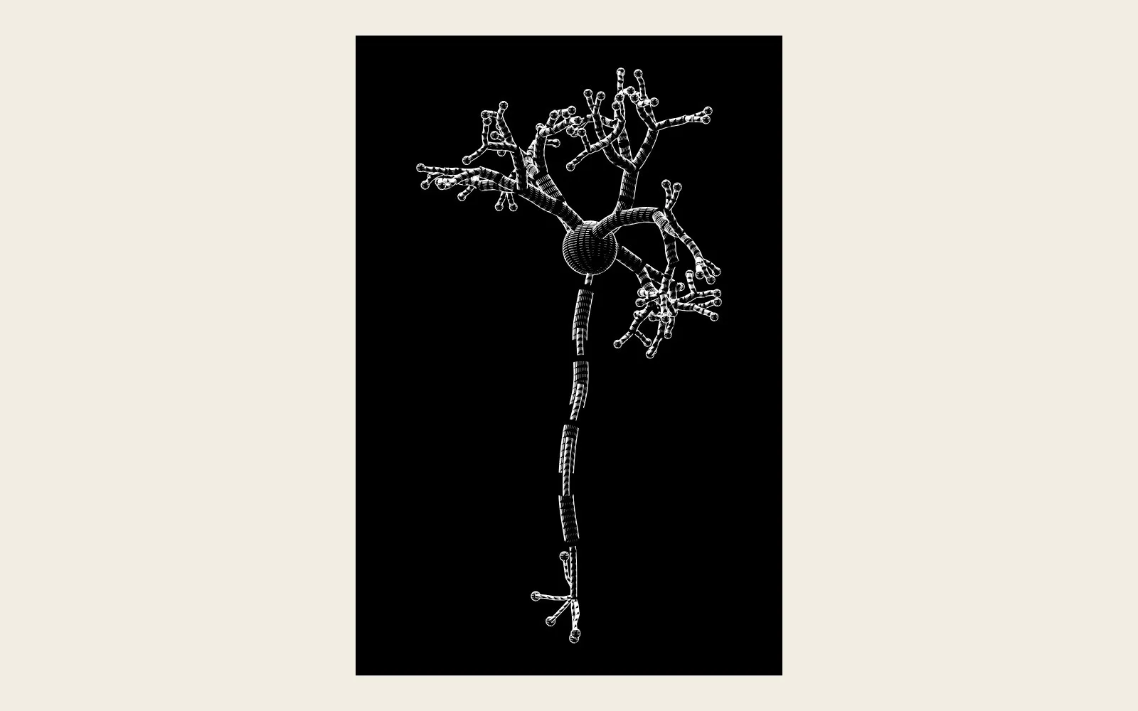
Neural: a neuron in 3D, after Cajal. 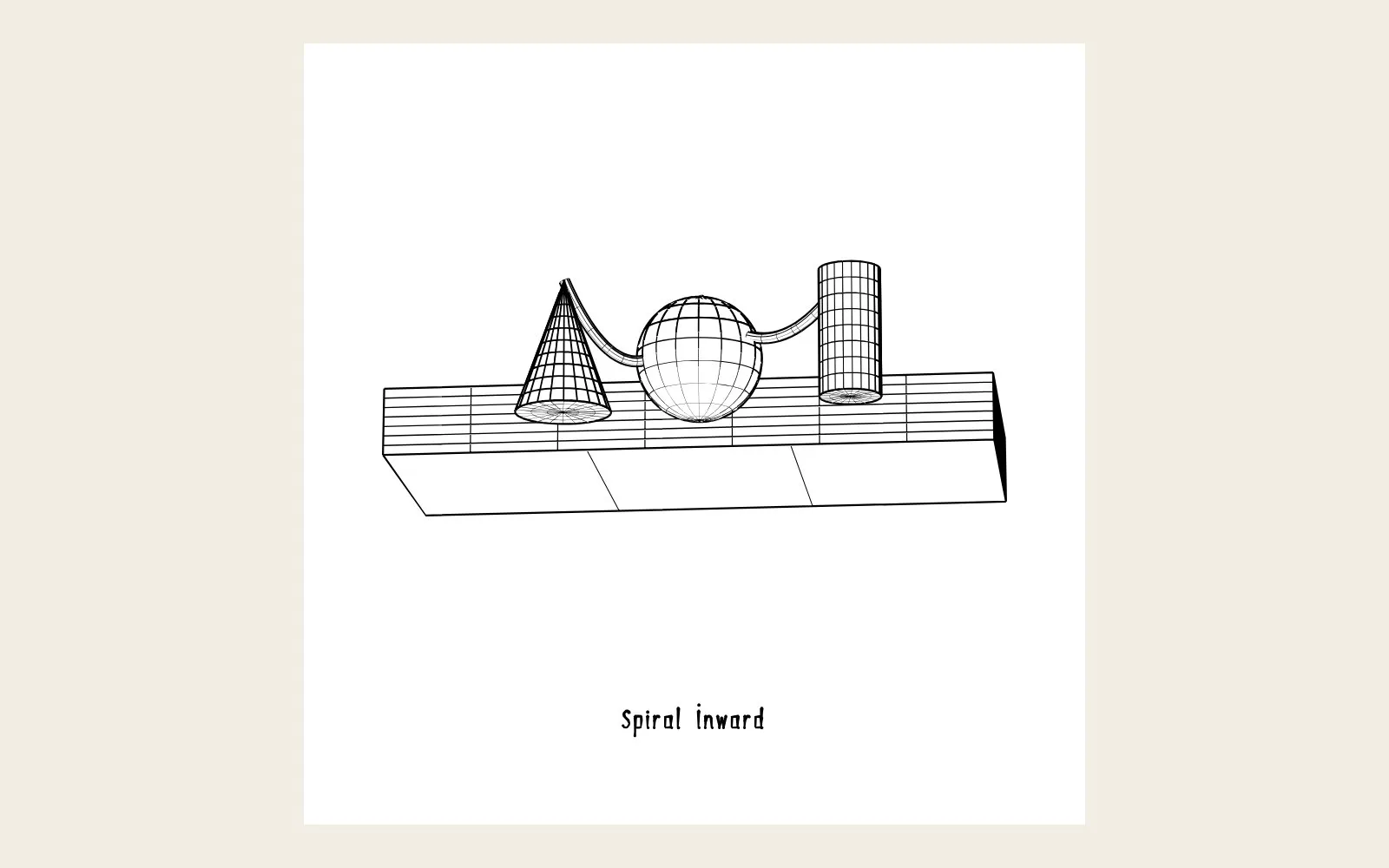
Conduit: still life on a plinth. 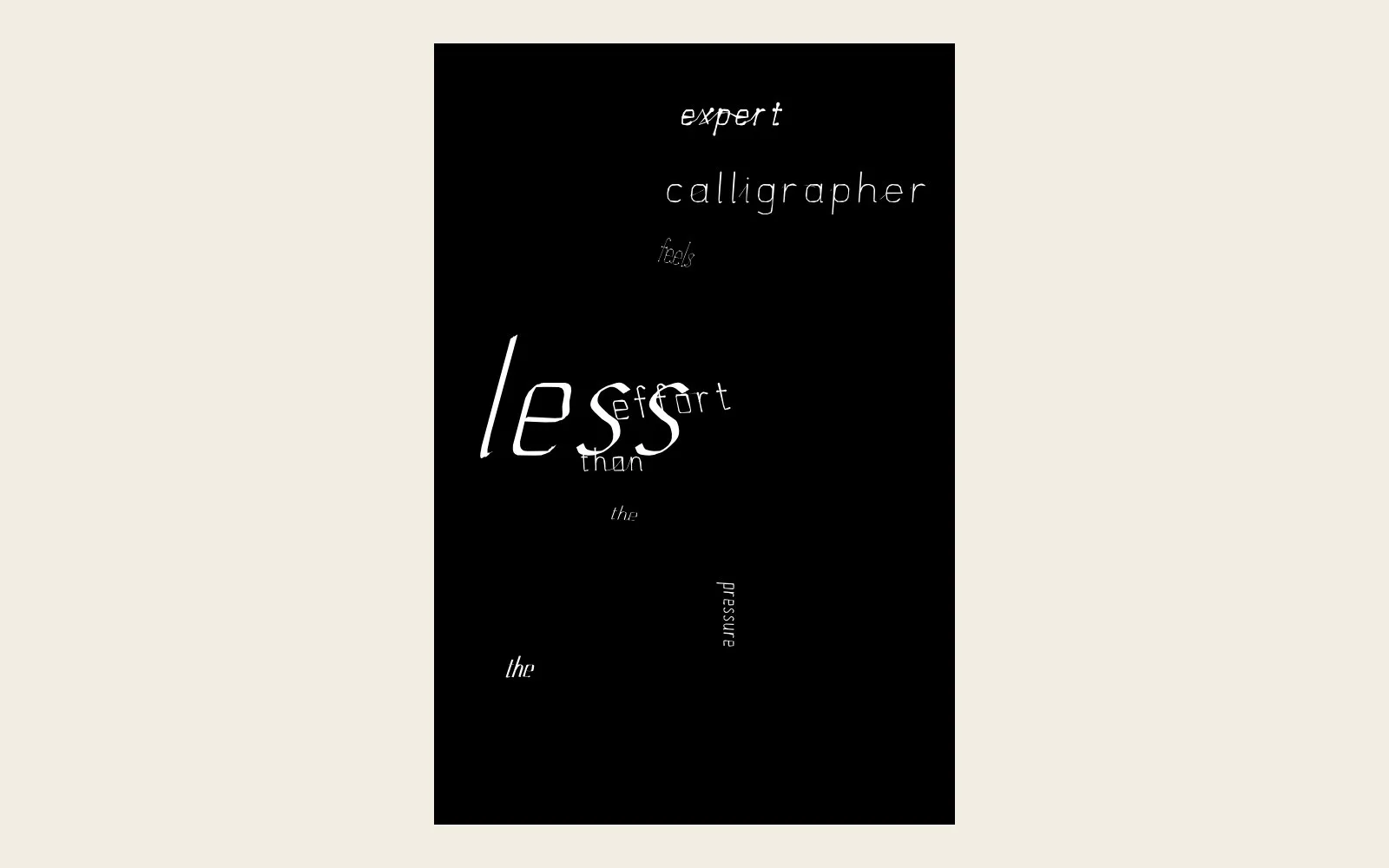
Concrete poem in Weft. 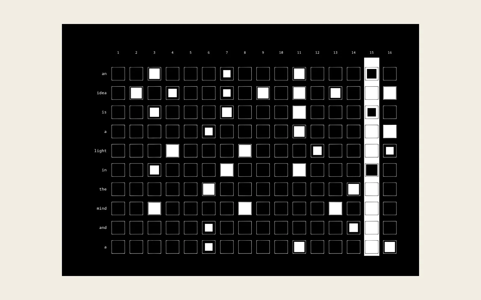
Signal: a sentence as a step sequencer, one track per word. 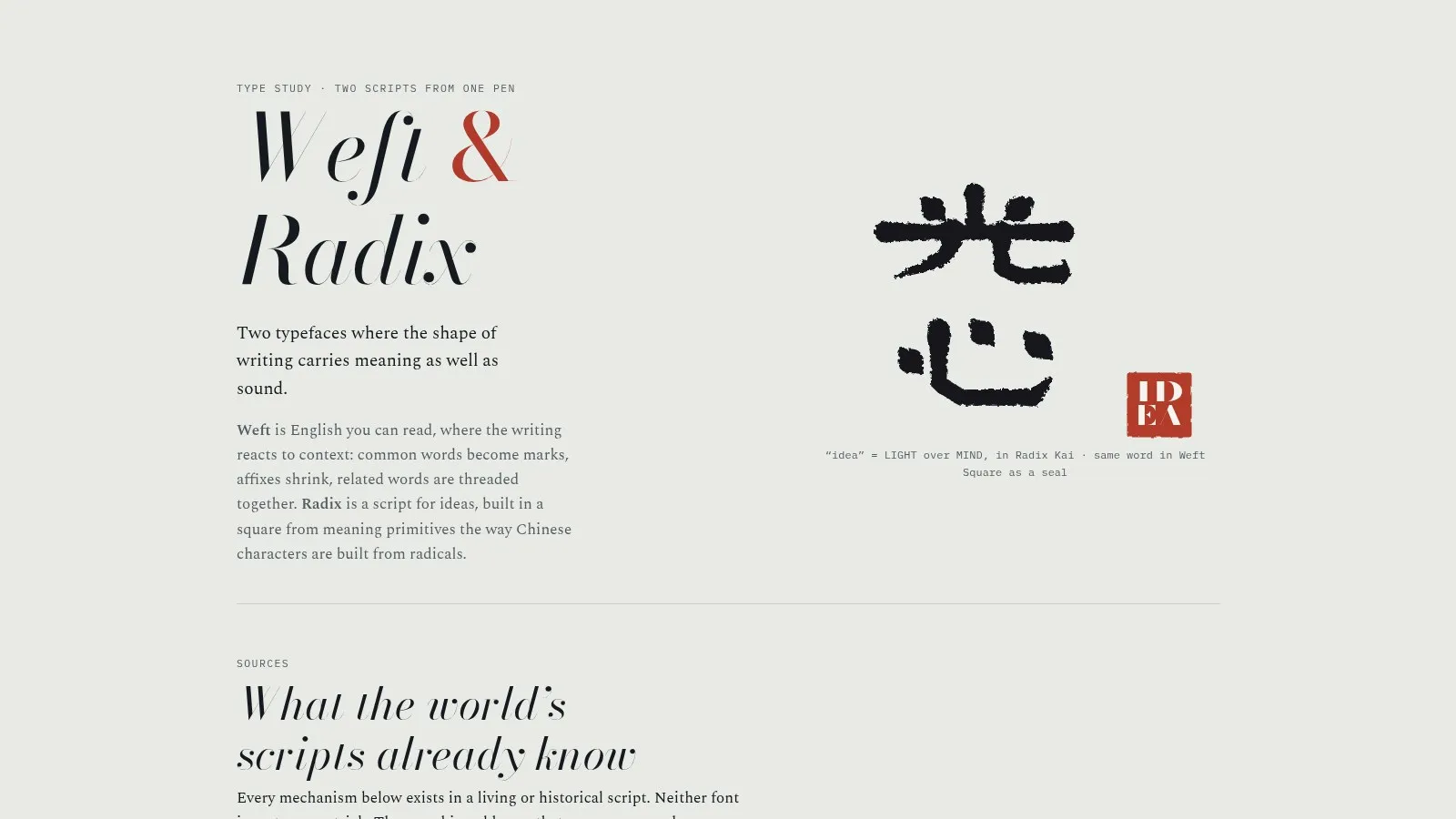
Weft & Radix, the type study: two scripts from one pen.
Journal
Credits
- Design, research, code — SVDK