Work / Research
Writing the Live Set
- PDFWorking draft, October 2026. A4, 27 pages. Evidence tags kept: [V] verified, [S] secondary, [K] background, [H] hypothesis, [D] design decision.Read the PDF
Abstract
Live-coded music is written in front of its audience: the performers’ code is projected, and the community’s own motto asks them to show their screens. Yet the code reaches the room in the typography of a text editor, set for one reader at arm’s length, in a monospaced face designed for prose-like source code. This paper asks what a typeface for live coding should be, and answers with a family of writing systems rather than a single font. We start from the evidence on how letters and words are read, and from the mechanisms that the world’s writing systems invented independently: silent classifiers, logograms, featural signs, compound blocks, registers. We apply them in three steps. First, two meaning-bearing scripts for English, Weft (English with layers of context) and Radix (glyphs built from meaning primitives by a position grammar), designed and measured in a parametric workbench. Second, a live-coding font in three layers (a base legible from the back of a room, signs for the language’s closed vocabulary, and live axes driven by the sound), grounded in a corpus of 218 FoxDot sets (925k characters). Third, a player script in which each line of code becomes one glyph, on the model of the Maya glyph block, drawn in eight registers that keep one grammar: glyph blocks, khipu cords, a machine matrix, broad-nib calligraphy, Ogham stones, cuneiform tablets, woven cloth and a star chart. We describe the design, its sources and its evidence status claim by claim, the real-time pipeline that drives the letters from each voice of the music, and the measurements made so far. We close with the experiments (X1–X36) needed to test the hypotheses, most of which are still open.
1. Introduction
In live coding, music is made by writing and rewriting a program while it runs. The performers’ screens are usually projected behind them, following the community’s principle that the audience should see what is being done (“show us your screens”) [33]S. The projected code is therefore part of the performance: it is how the audience sees the music being made, and, for many listeners, the only visible trace of the decisions behind the sound. Audiences seem to value seeing the code even when they follow it only in part [2]S.
The typography of that code, however, is inherited from programming. A monospaced editor face is designed for one reader, at arm’s length, scanning text whose structure is carried by indentation and punctuation. On a wall it meets a different reader (many at once, at five to thirty metres, glancing between the stage and the screen), a different medium (projected light, which blooms as ink spreads on paper), and a different text. Live-coded music is written in a small, closed vocabulary with a regular structure: in our corpus, about 25 synthesizers, 40 parameter keys falling into seven families, four kinds of time behaviour and four modifiers cover almost everything that is written (Section 5.1).
A closed vocabulary with a regular structure is exactly the situation in which human writing systems developed their most powerful devices: logograms for frequent words, silent classifiers that mark a word’s meaning class, featural signs whose shape encodes a property, and compound glyphs arranged by a position grammar. English prose, for which our fonts are designed, offers none of these opportunities; code does. This is the starting point of the work reported here.
Question. What should a font for live-coded music look like, when performers write in it, an audience reads it on a wall, and it should show the music as it happens? And what does “real time” demand of a font?
Approach. We answer with a family of writing systems, developed in four steps that each build on the last:
- a review of the evidence on how letters, words and meaning are read, and a survey of the mechanisms the world’s writing systems invented (Sections 2 and 3), first applied to a practical problem, ink-saving type, which fixed the project’s method;
- two meaning-bearing scripts for English, Weft and Radix, designed from those mechanisms and built in a parametric workbench, Scriptorium (Section 4);
- a live-coding font in three layers, grounded in a corpus analysis of our own sets (Section 5);
- a player script: one glyph per line of code, drawn in eight registers that share one grammar (Section 6), and driven in real time by the sound of each voice (Section 7).
Contributions.
- A design method for scripts that tags every design claim with its evidence status (verified against the source, secondary, background knowledge, hypothesis or decision), and keeps the status visible through to the final artefact.
- A corpus analysis of live-coded music as text (218 sets, 925k characters), showing that its typographic priorities are the reverse of prose: digits are a third of the text and punctuation is its texture.
- A three-layer live-coding font (base, signs, live axes) and the real-time rendering model it requires.
- The player script: a compound-glyph grammar for live code, modelled on the Maya glyph block and on Radix, with eight registers ranging from exact to gestural.
- A set of 36 experiments (X1–X36) that turn the design’s hypotheses into testable questions.
2. Background
2.1 Code as performance
Live-coding performances project code as a matter of principle [33]S. Our own practice uses FoxDot [17], a Python environment that drives SuperCollider: each player is a line such as c1 >> click(0, dur=var([1,1/2],8), hpf=linvar([40,400],128), amp=0.5).unison(3)
which names a player (c1), the sound it plays (click), its pitch material (0), and a set of qualifiers whose values may be fixed, held, ramped, random or stepped patterns. A set is a file of such lines, evaluated block by block during the performance.
The projected text has been treated mostly as a window onto the editor. Work on audiences suggests that they follow it partially and value it anyway [2]S. We take a typographic view instead: if the code is read, its typography is a design problem; if it is only seen, the problem shifts from legibility to what the visible form conveys. The design below tries to serve both cases.
2.2 Graphic scores
Graphic notation replaces the conventional score with drawings whose meaning the performer learns or invents: Cardew’s Treatise [3]K is the canonical example. Our player script sits between a score and a script: like a score it is read in time, alongside the music; like a script its signs have fixed values, so that the same code always gives the same drawing.
2.3 What writing systems invented
Writing was invented independently at least four times (Mesopotamia, Egypt, China, Mesoamerica), and re-invented many times since by people who could not read but had seen that writing existed (Cherokee, Vai, Bamum and others)S. It is best seen as a spectrum, from mnemonic devices (khipu cords, Luba memory boards, Lakota winter counts) through semasiographic systems that record meaning directly (Mixtec and Aztec pictography, Blissymbolics, emoji) to logographic, syllabic and alphabetic writing. Our survey of this history (the project’s writing_systems.md) identified fifteen recurring patterns. Table 1 lists those that shape the designs in this paper.
Table 1. Recurring patterns of the world’s writing systems (from the project’s survey) and where the designs use them.
| Pattern | Where it is used here | |
|---|---|---|
| P2 | Silent classifiers (determinatives), found in every independently invented logosyllabaryK | Weft meaning marks; family marks in the live font (Layer B) |
| P3 | Phonetic complements: redundant signs that disambiguate | Radix reading gloss (ruby); the “sound mark” inside a player glyph |
| P5, P6 | Simplification with use; a cursive register splitting off | Radix Seal, Kai and Grass registers; a Grass register of the player script |
| P7 | Composition in blocks (Maya, Hangul, Chinese) | Radix position grammar; the player glyph block |
| P8 | Shape encodes a systematic feature (Hangul, Cree, Pitman) | Featural scripts in Invent; behaviour marks and sparklines |
| P13 | The tool and surface shape the forms (reed on clay, chisel on stone, brush) | The eight registers: wedge, chisel, nib, knot, loom |
| P14 | Reading direction and layout are conventions | Cascaded code; spiral, column and boustrophedon layouts |
| P15 | Reinterpreting a foreign script creates a new type (Cherokee, Woleai) | Borrowed-letter scripts; reading code as a script |
2.4 Designed scripts
Several scripts were designed rather than grown, and their success informs ours: Hangul, whose consonant shapes picture the speech organs; Cree syllabics, where one shape turned four ways gives four vowels; Mandombe, built from two base shapesS. Blissymbolics composes meaning from a small set of primitives, as Radix does. In art, Xu Bing’s Square Word Calligraphy packs English words into Chinese-looking blocks. The lesson that the project took from designed scripts is that systematic shapes are learned fast: adults learning a new script do better when training stresses its systematic mappings [32]V.
3. Evidence, and a method from ink
3.1 An evidence-tagged method
The project began with a narrow question: how cheap can a typeface be to print while staying comfortably readable? The answer mattered less than the method it imposed. The literature on ink-saving fonts mixes vendor studies, student projects and perception research of very different strength, and some celebrated claims dissolve under scrutiny: a reported saving from switching to Garamond largely disappears once the fonts are compared at equal x-height rather than equal point size [21]K. We therefore adopted two rules that run through all later work.
- Compare fairly. Typefaces are compared at equal x-height, never at equal point size, and the costs that trade against each other (ink and paper; later, legibility and spectacle) are tracked together.
- Tag every claim. Each fact in the project’s notes carries its status: V checked against the source’s abstract or full text, S seen only in search summaries, K background knowledge not re-verified, H the project’s own hypothesis, D a design decision. The same tags appear in this paper.
A reference audit (September 2026) checked 33 of the perception references against their abstracts: 24 were confirmed, 9 needed corrections (years, authors, or a claim restated), 3 claims were removed or marked unverified, and 4 could not be checked. A second audit, for the communication-psychology review, confirmed 32 of 38 sources. “Verified” means that the citation and the specific claim match the abstract; it does not mean that the study’s methods were evaluated.
3.2 What the evidence says about letters and words
The findings that shaped every design below can be stated briefly.
Letters are identified by a few features. Observers identify letters by detecting about seven features independently, and identification efficiency is inversely proportional to perimetric complexity (perimeter squared over ink area) [23]V. Line terminations are the most diagnostic feature [9]V, horizontals the second (for capitals) [10]V. New alphabets reach fluent identification efficiency within about 3,000 trials [23]V.
Words are read through their letters. Words are recognised through a hierarchy of detectors, from letters to letter pairs to chunks [7]V; word outline plays at most a small role. Letters in the middle of a word are coded loosely and the outer letters strictly [25]V, though this varies across scripts [11]V. Words are split into morphemes from spelling alone [27]V.
Context substitutes for ink. Length and predictability have strong, independent effects on skipping and fixation [28]V, and English is famously redundant [30]K. Meaning visible in the form is picked up early, even before fixation, when the script shows it [29]V. Showing syntax by breaking lines at phrases improved reading in classroom trials [37]V.
Size, spacing and distance. About two cycles per character suffice for full reading speed, for characters between 0.3 and 2 degrees [18]V; below a critical print size reading slows sharply [19]K. Crowding makes spacing matter as much as shape [1, 24]K.
Scripts favour cardinal strokes and simplify with use. Across 116 scripts, strokes favour horizontals and verticals [22]V; letter junctions match their frequency in natural scenes [5]V; graphic complexity predicts learning difficulty [4]V. Scripts simplify with use [15]V, and signs that evolve inside a group become unreadable to outsiders [14]V.
Form carries meaning. In literate people the bouba/kiki effect is driven by letter curvature [6]V; round type goes with sweet [35]V; a typeface that clashes with a word’s meaning slows judgments [20]V. Deliberately disfluent type does not aid memory [8]K: every added layer has to earn its reading cost.
3.3 From ink to light
The ink study turned these findings into operators on letterforms, measured at 10 pt (relative to stem width u ≈ 0.09 em). Uniform thinning (LIGHT, 0.15u per side) leaves 68% of the ink; a feature-weighted treatment that thins stems but keeps junctions and terminals crisp (FW) leaves 61%; a hairline skeleton with heavy terminals (BONE) leaves 46%. Hollows, dots and scanlines save more on paper but are closed by dot gain on real printers, which is why printers must be calibrated before such designs are judged. The general principle, spend ink on the features the eye uses, carries directly to projection, where the medium inverts: light blooms instead of ink spreading, so white-on-black text looks bolder and thin dark gaps between bright strokes close (Section 5.3).
4. Scripts that carry meaning
Before turning to code, the project designed two scripts for English. They are not new languages: nothing in them has its own words or pronunciation. They are writing systems, different ways of putting meaning on a page, each borrowing mechanisms from real scripts. Their decisions were later carried, almost one for one, into the live-coding font.
4.1 Weft: English that carries context
Weft writes ordinary English in a semi-joined hand (letters stay distinct, since words are read through their letters) and adds optional layers that restore some of what speech carries and plain text loses:
- Determinatives: a small mark above the first letter giving the kind of thing a word is (person, place, feeling…), after Egyptian classifiers (P2). Revised from “after the word” once the evidence showed that meaning cues work best seen firstD.
- Logograms: about fourteen frequent function words as single signs, as in scribal abbreviations and shorthand; chosen by predictability in context, since predictable words cost least to compressD.
- Phrase-lines: a headline across each noun phrase, after the Devanagari shirorekha.
- Negation: not is kept in the text, and a wave over the negated word flags it (revised from deleting not, which is short but never predictable)D.
- Cascade and prosody: lines broken at clauses (visual-syntactic formatting [37]V), weight following stress.
Every layer can be switched off: the text stays plain English underneath.
4.2 Radix: glyphs for ideas
A Radix glyph is a picture of a definition, built from 34 primitives (LIGHT, MIND, PAST, FUTURE, PERSON, HOUSE, FEEL, NOT and others) by a position grammar: A|B side by side (category left, core right), A/B stacked (quality above, ground or cause below), A[B] enclosed (scope), A+B overlaid (negation or tension) and ~ A mirrored (reversed direction). So idea is LIGHT/MIND, memory MIND/PAST, forget (MIND/PAST)+NOT and nostalgia HOUSE[FEEL/PAST]. The grammar follows the evidence that Chinese semantic radicals are coded by position [38]V and that systematic mappings are learned better than arbitrary ones [32]V. Three decisions came from the communication-psychology review:
- time runs toward where lines begin (“past” points left for left-to-right readers), with a mirrored edition for right-to-left readers, since spatial time follows reading direction [12]V;
- every mirror pair gets a second, non-mirror cue, since mirror discrimination is learned and fragileV;
- three registers, Seal (geometric), Kai (brush, for reading) and Grass (one gesture), after the universal split of a cursive register (P6), with Grass anchored to Kai so that simplified forms stay readable to newcomers [14]V.
4.3 Scriptorium: designing scripts as parameter spaces
Both scripts, and an Invent generator that creates a new writing system for English per random seed (alphabets, Cree-style rotation, abugidas, Hangul-style blocks, featural scripts, Ogham, Braille, shorthand), were built in a parametric workbench, Scriptorium. Its architecture is the part that matters for the rest of this paper (Figure 1):
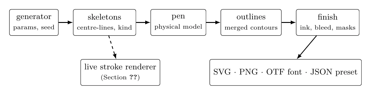
Figure 1. Scriptorium’s pipeline. Generators emit skeletons, never ink, so any script can be written with any pen, and the sheet, the font and the live renderer share one geometry.
- Generators emit skeletons, never ink. A skeleton is a centre-line tagged with the gesture that made it (after the eight basic strokes of Chinese calligraphy) and the size its weight is relative to.
- Pens are physical models, not styles. A broad nib’s contrast comes from its angle, a brush’s from the gesture’s pressure; a bone pen draws a hairline body with heavy terminals, after the BONE ink operator; a wedge pen presses like a reed into clay. Randomising a pen therefore gives plausible writing, not noise.
- One geometry for every output. The outlines go into the sheet, the raster and an installable OpenType font (with kerning and logograms as discretionary ligatures), so what is exported is what was measured.
- Measurement in the loop. Each sheet reports its ink coverage and the perimetric complexity of its glyphs, the quantity that predicts identification efficiency [23]V, so a complexity budget can be enforced while designing.
- Seeded variation. Every random draw comes from a stream salted by purpose, so a design is reproducible and families of siblings can be explored by varying, locking and re-rolling parameters.
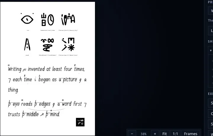
Figure 2. A Scriptorium sheet: Radix glyphs (top) and Weft English with its meaning layers (bottom), drawn with the same pen.
Two consequences prepare the live-coding work. First, a font built from skeletons and a pen can be inked as a static font and re-inked every frame. Second, the workbench already contained a reader for FoxDot code (its Score generator draws a set as a graphic score), which became the parser behind the player script.
5. A font for live code
5.1 The text we are designing for
A typeface is designed for a text. This one is designed for FoxDot code as we actually write it: a corpus of 218 sets (925k characters, 8,552 lines of code) from our own performances. Table 2 summarises what it contains. The counts reverse the usual priorities of type design.
Table 2. The corpus: 218 FoxDot sets from our performances.
| Measure | Count | Consequence |
|---|---|---|
| Lowercase / digits / uppercase | 347k / 167k / 17k | Digits are a third of the text; capitals barely matter |
| Most frequent characters | , 89k; = 43k; . 33k; ( ) 26k each; [ ] 15k each | Punctuation is the texture of the page; the comma is the most common character |
>> | 5,542 | The verb of the language: “this player plays this sound” |
| Line length | median 61, 90th percentile 253, maximum 1,010 | A wall cannot show long lines whole: it needs a layout |
| Player names | d1 1,112; b1 457; p1 314… | One letter and a digit: a tiny closed set |
| Synths | about 25 cover almost all lines | Logogram candidates |
| Parameter keys | dur 4,642; amp 3,057; sample 2,100; oct 2,001…; about 40 keys cover 90% | Seven families: time, level, pitch, brightness, space, grit, motion |
| Pattern functions | var 3,101; linvar 2,154; PRand 1,628; PWhite 1,616… | Four behaviours: held, ramp, random, stepped |
| Methods | .unison 1,210; .stop 699; .sometimes 384; .every 302 | Four modifiers: thicken, silence, chance, recurrence |
play("…") strings | 1,750, median length 3 | A rhythm alphabet of about ten symbols |
This is a small closed vocabulary with a regular structure, the situation in which scripts historically grew logograms, classifiers and featural signs (P2, P7, P8). English prose is the opposite. We therefore expect the mechanisms of Weft to work better on code than they ever could on EnglishH.
5.2 Three layers
The font is one family in three layers, mirroring Weft’s architecture (Table 3). The performer’s screen shows layers A and B, still; the wall shows all three, moving (Figure 3).
Table 3. The live-coding font’s three layers.
| Layer | What it is | Where it comes from |
|---|---|---|
| A. Base | Monospaced letters that read from the back of a room | Letter-feature evidence; projection treated like dot gain |
| B. Signs | Marks that make the language’s vocabulary and structure readable at a glance | Weft’s logograms, determinatives, phrase-lines and negation |
| C. Live | Glyph shape driven by the sound, per voice | Cross-modal correspondences (bouba/kiki); the pen model |
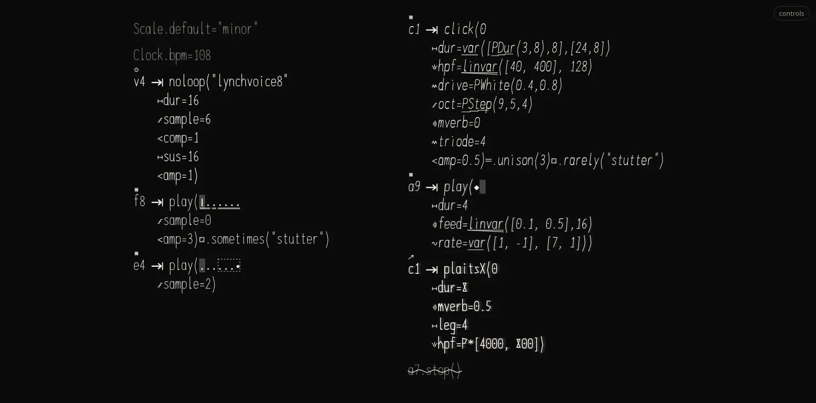
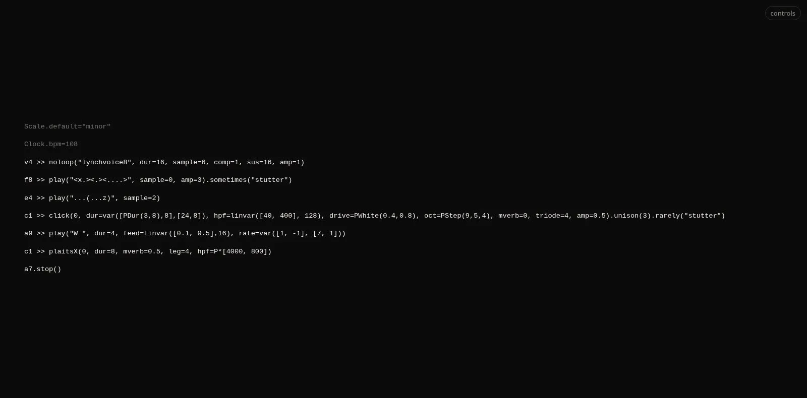
Figure 3. Layers A+B+C on real code: family marks before keys and above players, >> as one sign, behaviour
marks under patterned values, rhythm strings as notation, lines cascaded by structure, .stop() struck
through with the negation wave.
5.3 Layer A: reading from the back
Size. Taking about 0.4 degrees of x-height as comfortable for glance reading [18]H, a four-metre wall carries about 100 characters per line at 5 m, 50 at 10 m and 25 at 20 m. With a median line of 61 characters and one line in ten over 250, the wall needs a layout, not only a font: lines are cascaded at >> and at each keyword argument, so that a long line becomes a small vertical block (the Weft cascade applied to code), and the line just evaluated is shown large while the rest of the set recedesD.
Letterforms. The pairs that code punishes are disambiguated (0/O, 1/l/I, ,/., :/;); punctuation is drawn at full weight, open and slightly large, since crowding makes spacing matter as much as shape [24]K; numerals are tabular, with true fractions for the beat values that recur (1/2, 1/4, 0.25). Capitals, 2% of the text, can stay modest.
Projection is printing with light. The ink study treated dot gain as part of the design. A projector does the mirror image: light blooms, so white-on-black text looks bolder than black-on-white at the same weight, and thin dark gaps between bright strokes close. We keep a lighter “dark stage” master, open counters, and a per-venue calibration sheet (gap, hairline, hole), as for printersH. Terminals, the features the eye uses most, survive bloom best, which makes the BONE treatment worth testing on stage.
5.4 Layer B: Weft for code
Each Weft layer has a direct counterpart in code, and the code case is easier: a parser knows the grammar exactly, so the analyser errors that make Weft risky on English (a wrong meaning mark) do not arise.
- Logograms:
>>becomes one heavy arrow-into sign. Synth logograms are deferred, because arbitrary signs cost the most to learn [32]V. - Determinatives: a family mark above each player name (drums, bass, pad, lead, keys, voice, noise, sample) and before each parameter key (time, level, pitch, brightness, space, grit, motion), after Egyptian and Sumerian classifiers.
- Phrase-lines: a line over one player’s call, from
>>to its closing bracket. - Negation:
.stop()receives Weft’s negation wave. - Time behaviours as an abugida: in an abugida a base letter is modified by vowel marks; here a value is the base and its behaviour a mark on it (held: a bar; ramp: a wedge; random: scattered dots; stepped: a stair). Each ramp mark has a second cue besides its direction, since mirror-only distinctions are hardV.
- Rhythm strings as notation:
play("x-o[--]")is typeset as the rhythm it is (xa heavy stroke,oa ring,-a tick,.a rest dot, brackets as beams).
Every sign is a ligature or contextual form over the real characters, so copying the text still gives exact code, and every class of sign can be switched offD.
5.5 Layer C: the music in the letters
On the wall the sound shapes the type. The mappings are the ones the whole project uses, so that everything reads the same way (Table 4). They are applied per voice: each line follows its own player, so that the bass line swells when the bass plays, and the wall reads as an ensemble rather than a single meterH.
Table 4. Layer C: sound to glyph.
| Sound | Glyph axis | Basis |
|---|---|---|
| Level | Weight | The most direct mappingH |
| Brightness (filter, spectrum) | Angularity and contrast, round to sharp | bouba/kiki driven by letter shape [6]V |
| Motion (ramps, LFOs) | Slant or sway of the changing value | Motion attracts the eyeH |
| Beat, onsets | A pulse in weight, decaying within the beat | EntrainmentH |
| Grit (drive, crush) | Roughness: tremor, dry brush | The pen model’s hand parameters |
| Space (reverb, echo) | Faint trailing copies | Reverb as visual decayH |
| New code evaluated | The changed tokens write on in stroke order | Watching a stroke being made raises its appealV |
Silence (.stop()) | The negation wave, then a fade | Weft negation |
Every live axis costs some reading. That is acceptable on the wall, where the audience reads gist, and forbidden on the performer’s screen; weight never falls below the stroke width that survives projection bloom.
5.6 What real time demands of a font
A normal font is shaped once, when the text is set. A live font is reshaped every frame and re-set on every evaluation. Static OpenType fonts handle Layer B natively but cannot move; variable fonts can move, but every axis change re-lays out the text, which thrashes when each glyph animates on its own. The wall therefore draws the skeletons directly, as strokes inked every frame: at about 60 lines of 60 glyphs of 30 segments, roughly 100k segments, well within a browser’s budget. The family ships in two forms from one source: skeletons inked by a pen into a font for the editor, and the same skeletons as data for the live renderer (Figure 1). Three rules followD:
- Lay out on evaluation, shape every frame. Parsing and layout happen only when the code changes; the frame loop updates per-voice values (level, brightness, beat phase, write-on progress) and never shapes text.
- Beat-locked motion from the clock, continuous shape from the audio. Motion on the beat is predicted from the clock, so it lands on time; shape that follows the sound comes from analysis and lags slightly, which viewers tolerate far better than a picture that leads the sound [34]S.
- Deterministic. The same code, audio and time give the same frame, so a show can be re-rendered.
6. The player script
The live-coding font makes code legible. The player script goes one step further, as Radix went beyond Weft: each player line becomes one glyph, and a set becomes a composition of glyphs.
6.1 Why a player can be one glyph
A player line has one head (the synth) and a handful of qualifiers, each belonging to one of a few families. That is the shape of a logographic block, not of a sentence:
c1 | who plays |
>> click | what sounds (the synth) |
(0, …) | pitch material |
dur=var(…) | time (held) |
hpf=linvar([40,400],128) | brightness (ramp) |
drive=PWhite(.4,.8) | grit (random) |
mverb=0, amp=0.5 | space, level |
.unison(3), .rarely("stutter") | thickening, scope (chance) |
With about 25 synths, 40 keys in seven families, four behaviours and four modifiers (Table 2), the vocabulary is small and closed, which is where scripts grew compound glyphs (P7).
6.2 The model: the Maya glyph block
Of the systems surveyed, Maya writing fits best. A Maya glyph block has a main sign carrying the core meaning and affixes in fixed places around it (prefix, superfix, subfix, postfix); readers learn each position’s role, and blocks are read in pairs of columns. We use that frame, with Radix’s position meanings (category left, quality above, ground or cause below, scope as enclosure, negation as overlay) assigned to the player’s parts (Table 5)D.
Table 5. The player glyph block.
| Position | Player part | Sign |
|---|---|---|
| Main sign | The synth | Its family radical: drums a solid block, bass a heavy bowl, pad a double dome, lead a rising arrow, voice a mouth ring, noise zigzags, keys bars on a base, a bell, sample a spiral |
| Sound mark (inside) | The synth’s name | One of twelve small marks, so that dbass and lbass share the bowl but differ: semantic radical plus sound component, as in Chinese characters |
| Edges | Octave, level | A tick per octave at the pitch field’s edge; the level bar first in the rack (live, the main sign also thickens with the sound) |
| Prefix (left) | Player name | Its letter (a Weft skeleton) and its digit as dots |
| Pitch field (right) | Degrees, chords | A small staff: steps left to right, chords stacked, alternations beamed |
| Superfix (top) | Filters | The frequency response on a log axis: high-pass rises, low-pass falls, band-pass bumps |
| Subfix (bottom) | Time | The play() rhythm as notation, or dur as tick spacing |
| Effects rack (right) | Level, effects in code order | One icon per family (arcs for reverb, decaying repeats for echo, a clipped wave for drive, a staircase for crush) with its amount as a bar |
| Frame | .every, .sometimes | Closed (recurrence) or dashed (chance) |
| Echo | .unison(n) | The main sign drawn n times, stacked |
| Overlay | .stop() | Radix’s NOT stroke across the glyph |
| Cartouche | A code block | A frame around its glyphs, as Maya groups blocks into clauses |
One sign for every pattern. A small evaluator of FoxDot’s value expressions draws every patterned value as what it does over twelve steps, as a sparkline: a level line for a number, a stepped line for lists and var, a contour for ramps and sines, scattered dots within a dashed band for PWhite, on/off bars for Euclidean rhythms and coin flips. This replaces abstract behaviour marks with the actual shape of the value, the most iconic sign available for a function of time; iconic signs are learned faster [13]V.
The evidence, applied. Each position has one job, so a new synth is readable from its radical before its name is known (systematic over arbitrary [32]V). The family radical is the largest, central form, because meaning cues work best seen first [29]V. A glyph has at most one main sign and six affix zones of one to five strokes each: a complexity budget [23]V. Radicals keep to cardinal strokes except where the diagonal is the meaning (the lead’s rising arrow) [22]V. Grit and brightness are angular signs, pads and bass round ones [6]V. A small ruby label (name~·~synth) under each glyph makes the script learnable and can be switched off once it is learned.
Live. Glyphs are built on evaluation and animated every frame from their own voice: weight with level, a kick on onsets, sharper superfix strokes as the filter opens. A re-evaluated player changes only what changed: identical strokes stay, changed ones morph from their old shape (a new cutoff slides the filter curve), new ones write on in stroke order, removed ones fade. A stopped player is crossed by the NOT stroke and fades.
6.3 How code becomes a glyph
This subsection shows the grammar at work. Every image below is rendered by the system’s own glyph code from the line of code printed under it, still (not animated), so that each figure isolates what one change in the code does to the glyph. The figures are regenerated from a single list of variants (paper/tools/glyph-figures.mjs).
From a line to a block. A line is parsed into its parts: the player’s name, the synth, the positional argument (pitch material, or the rhythm string for play), the keyword arguments, and the methods chained after the call. Each keyword is classified into one of the seven families (time, level, pitch, brightness, space, grit, motion), and each value is read as an expression, so that a pattern such as linvar([400,4000],16) is known by what it does over time, not only by its first value. The parts are then placed in the fixed zones of the block (Figure 4); a part absent from the code leaves its zone empty, so an empty zone also carries information.
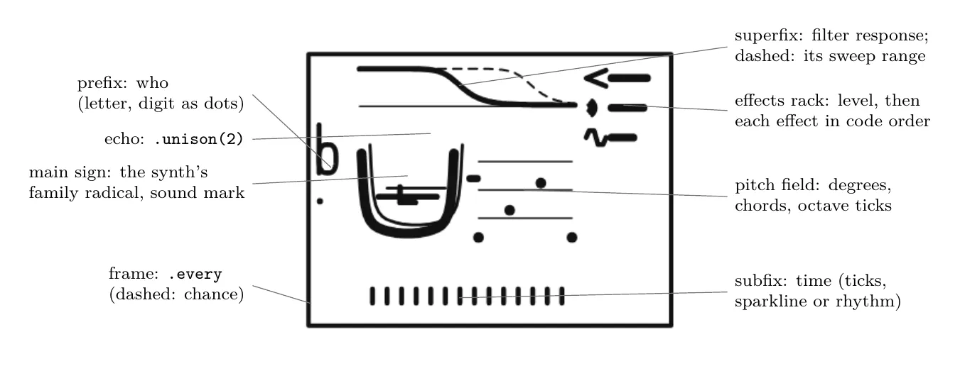
Figure 4. Anatomy of a player glyph, rendered from
b1 >> dbass([0,2,4], dur=1/2, amp=0.8, lpf=linvar([400,4000],16), room=0.6, drive=0.4).unison(2).every(4, "stutter").
The main sign. The synth’s family chooses the radical (Figure 5): nine closed shapes, each drawn from a few strokes, mostly cardinal. Two synths of the same family share the radical and differ by a small sound mark inside it, chosen from the synth’s name; the player’s letter and its digit (as dots) form the prefix, and the octave and the level are read at the edges of the block (Figure 6).
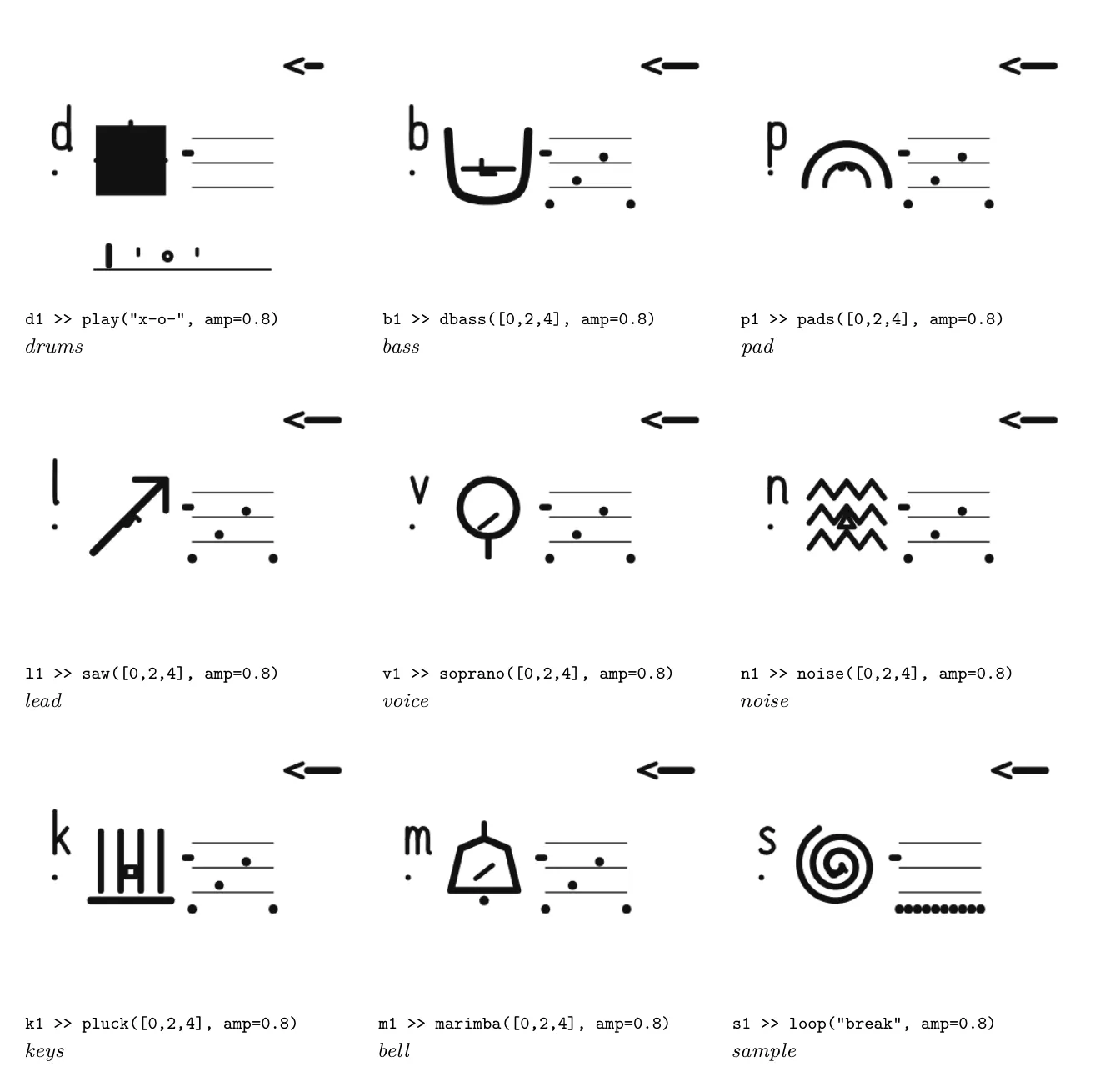
Figure 5. The main sign: one family radical per kind of synth. Same pitch material and level in every glyph; only the synth (and the player’s name) changes.
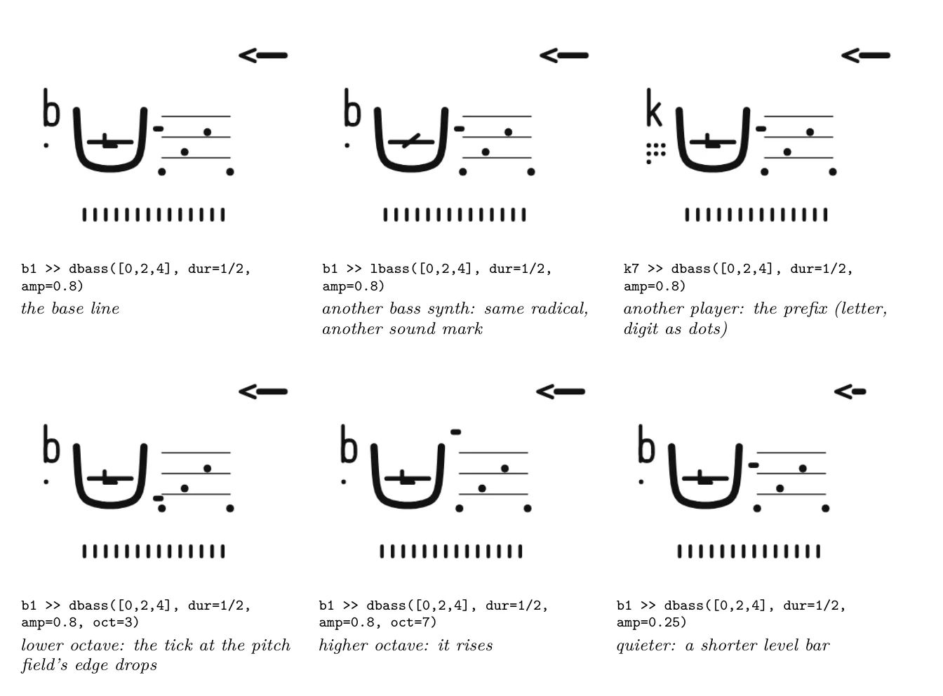
Figure 6. Changes around the main sign: the synth within a family, the player, the octave and the level.
Pitch. The positional argument is drawn in a small staff to the right of the main sign: a list as steps from left to right, a tuple as a chord (dots stacked on a stem), a nested list as an alternation (a dashed beam), and a pattern as the contour it produces (Figure 7).
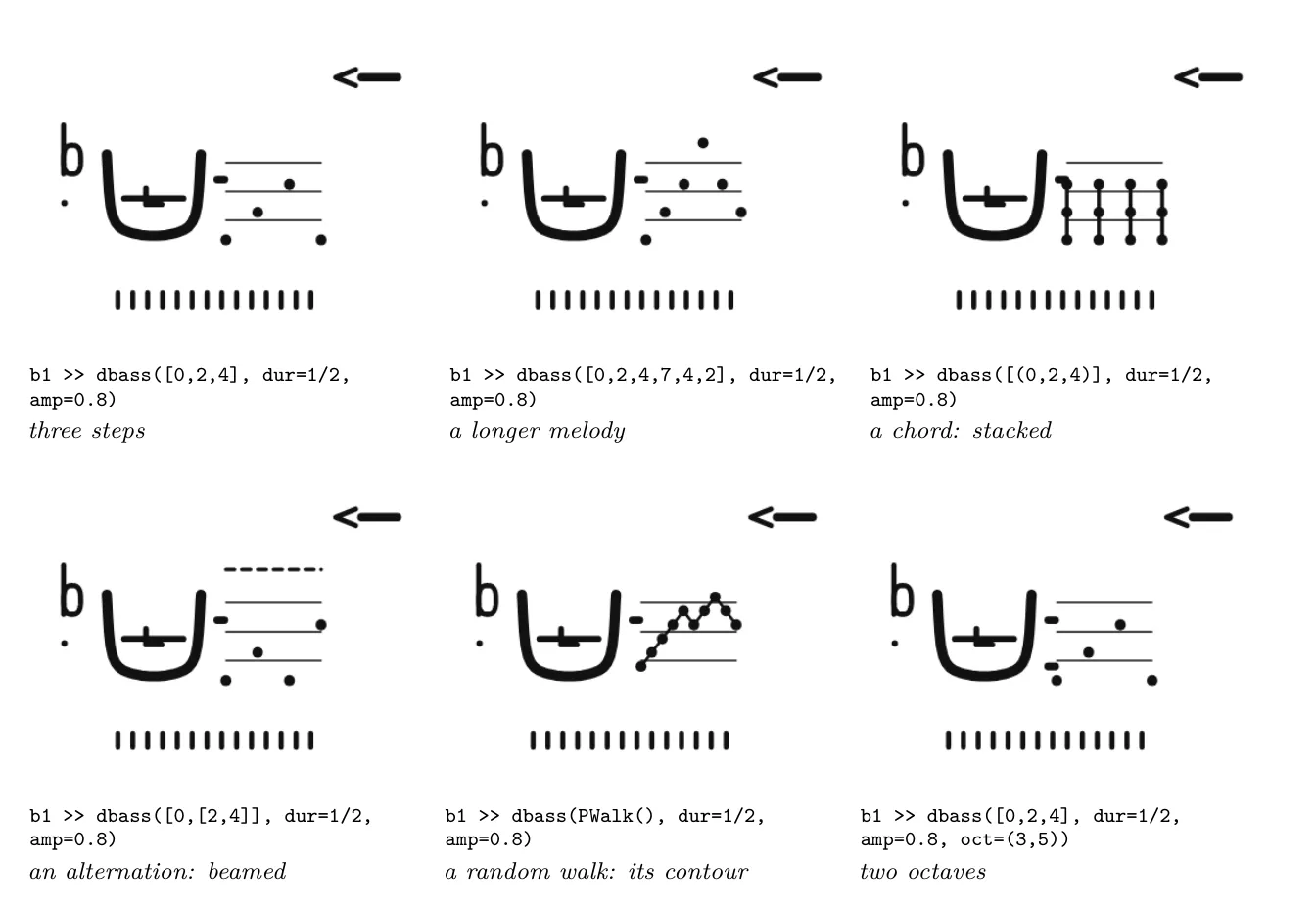
Figure 7. The pitch field.
Brightness. Filters are drawn as their frequency response above the block, on a logarithmic axis from 20 Hz to 20 kHz: a high-pass rises, a low-pass falls, both together make a band, a band-pass a bump. A cutoff that moves shows its whole range as two dashed curves around the current one (Figure 8). The superfix is the most iconic zone of the block: the sign is a picture of what the filter does.
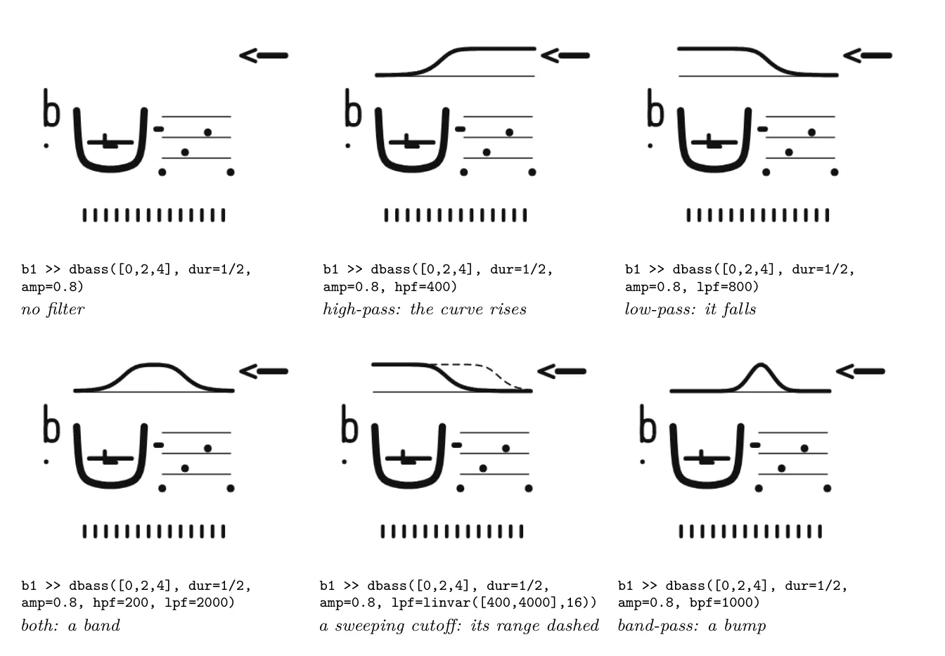
Figure 8. The superfix: filters as their frequency response.
Time. Below the block, a fixed duration is a row of ticks whose density follows the tempo of the notes; a duration pattern is drawn as its sparkline; a play rhythm string is set as notation (Figure 9).
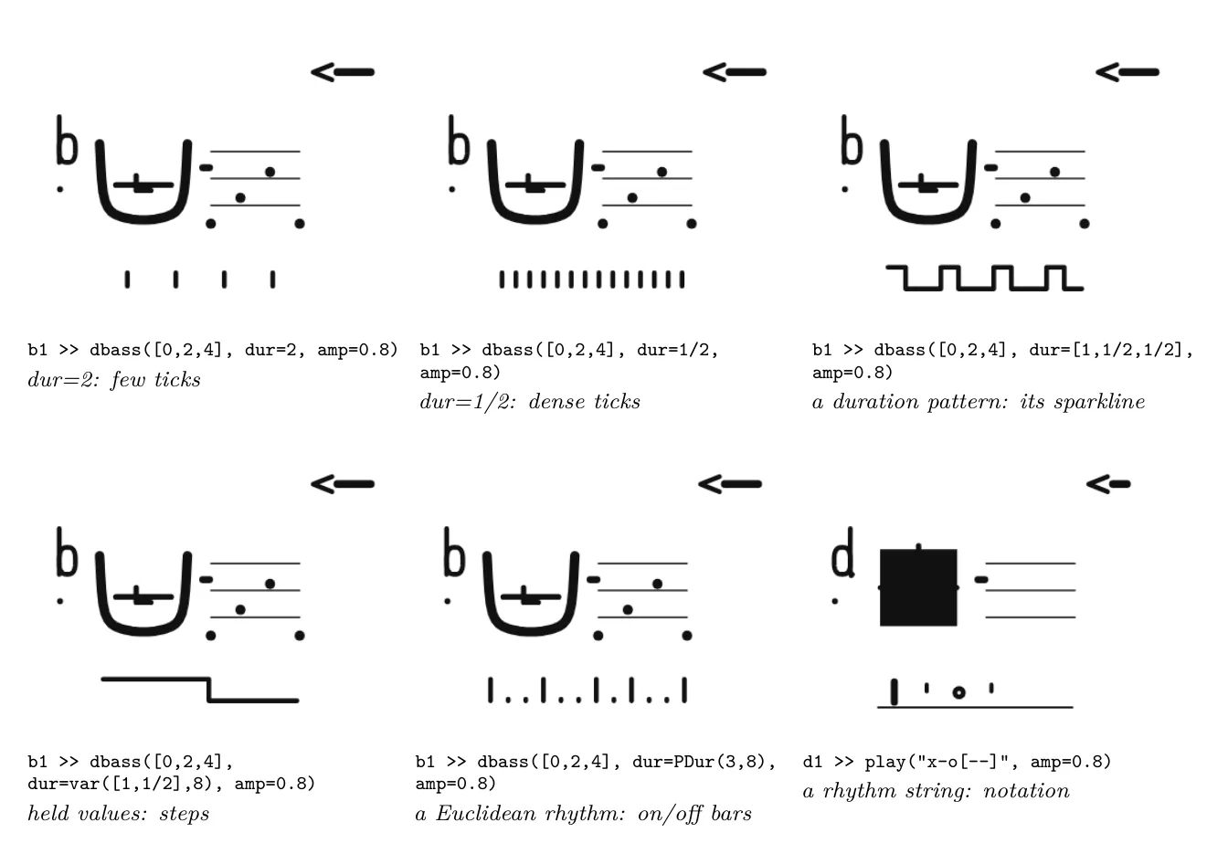
Figure 9. The subfix: time.
The effects rack. To the right, one row per effect family, level first and then each effect in the order it appears in the code: an icon for the family (arcs for reverb, decaying repeats for echo, a clipped wave for drive, a staircase for bit crushing, gates for chop) and a bar for its amount (Figure 10).
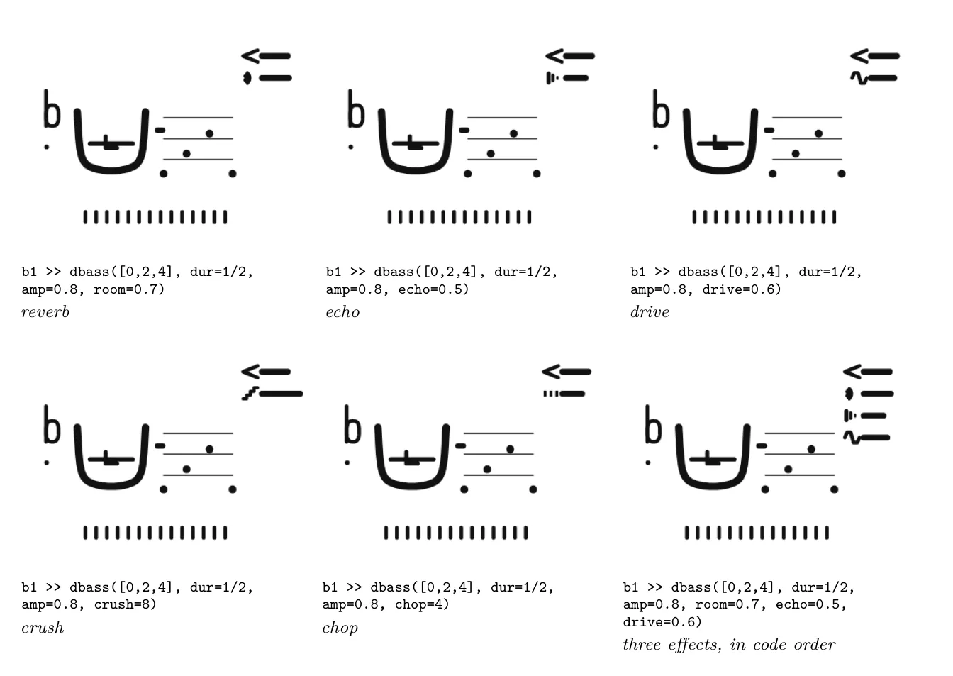
Figure 10. The effects rack.
How values move. Any value can be a pattern. Instead of a bar, its row then shows a sparkline of twelve steps of the pattern: a ramp as its contour, a random value as dots scattered in a dashed band, a held value as steps, coin flips as on/off bars (Figure 11). The same sign is used for every part of the block, so a reader who has learned it once reads it everywhere: pitch, filters, effects and time.
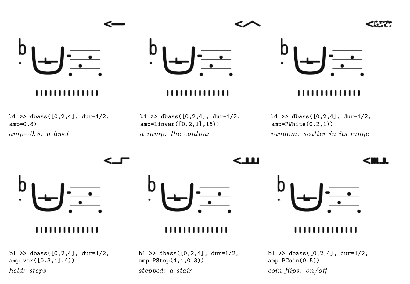
Figure 11. Behaviours: the level (amp) as a constant, a ramp, a random value, held values, a stepped pattern and
coin flips.
Modifiers. Methods chained after the call act on the whole block: .unison echoes the main sign, .every frames the block and .sometimes frames it with a dashed line (chance), and .stop() crosses it with Radix’s NOT stroke and dims it (Figure 12).
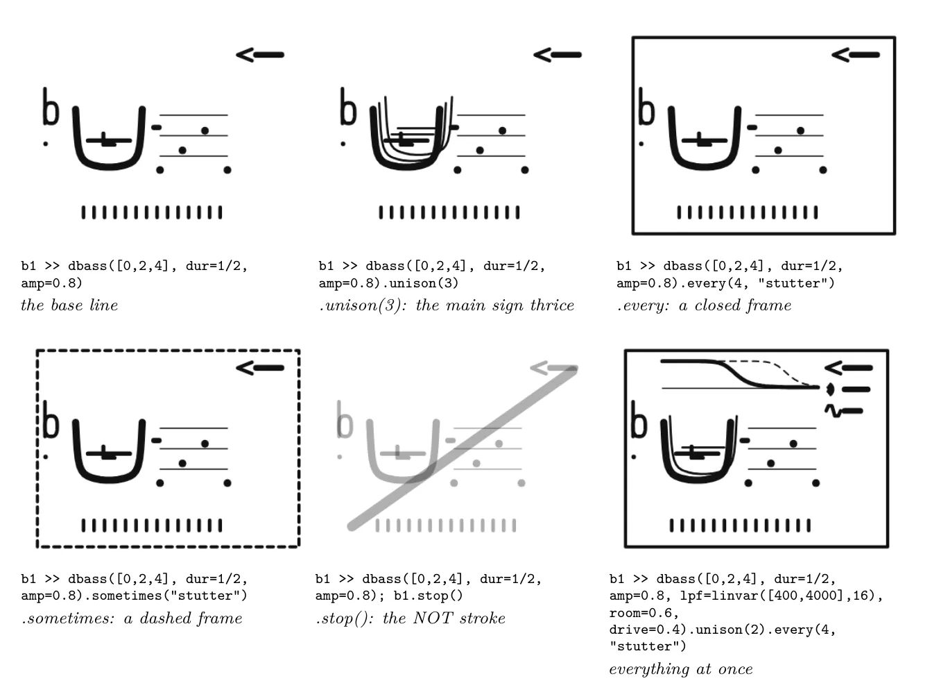
Figure 12. Modifiers, and a line with several parts at once.
What the still images do not show. In performance the block also moves with its voice (Section 7): the main sign thickens with the sound’s level, the whole block kicks on onsets, and a re-evaluated line morphs only the strokes that changed. In a still rendering the level is read from the rack’s bar alone.
6.4 Eight registers, one grammar
Real scripts have registers: the same script carved, written for reading, or dashed off in one gesture (P6). The player script has eight, each borrowing its form from a different system and its stroke from a different tool (P13), while keeping the same reading of the code (Table 6, Figure 13). The registers are not styles of one drawing: each answers a different question about the set.
Table 6. The eight registers of the player script.
| Register | After | A player is | What it shows best |
|---|---|---|---|
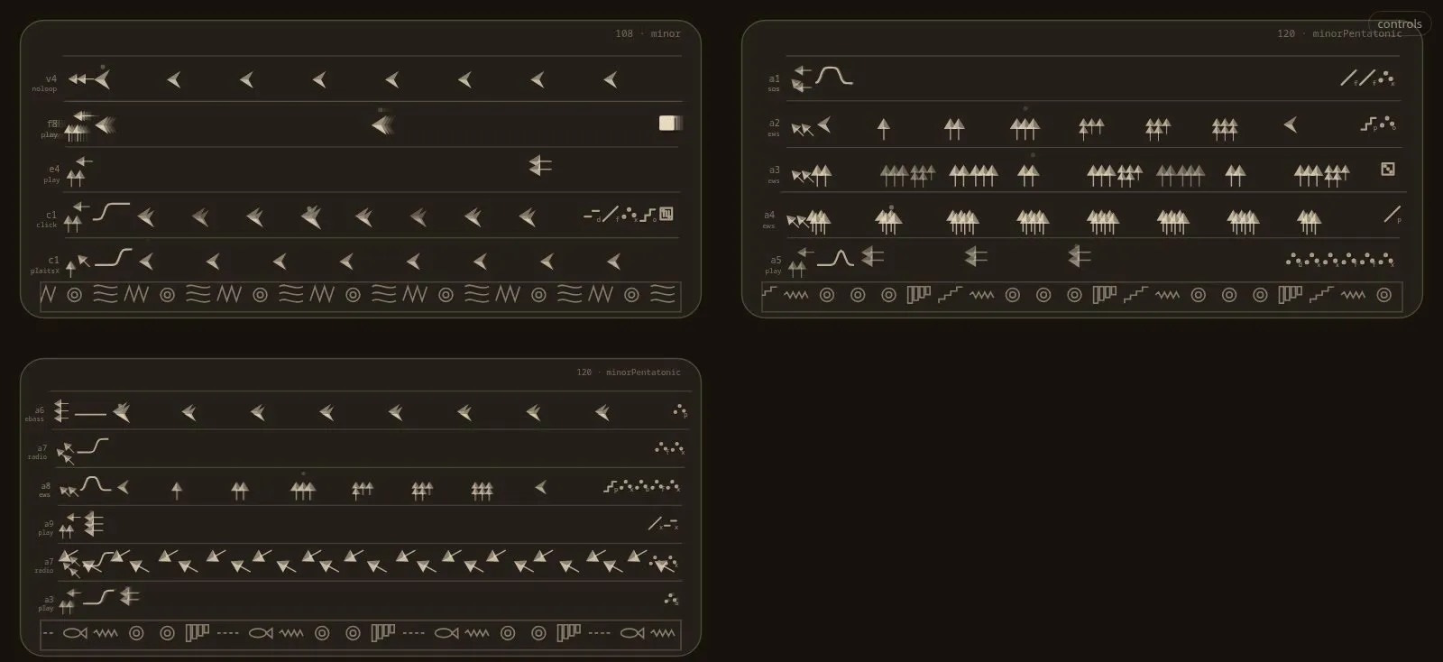
| Glyph blocks | Maya blocks, Radix | A compound glyph (Table 5) | Exact reading: every parameter has a place |
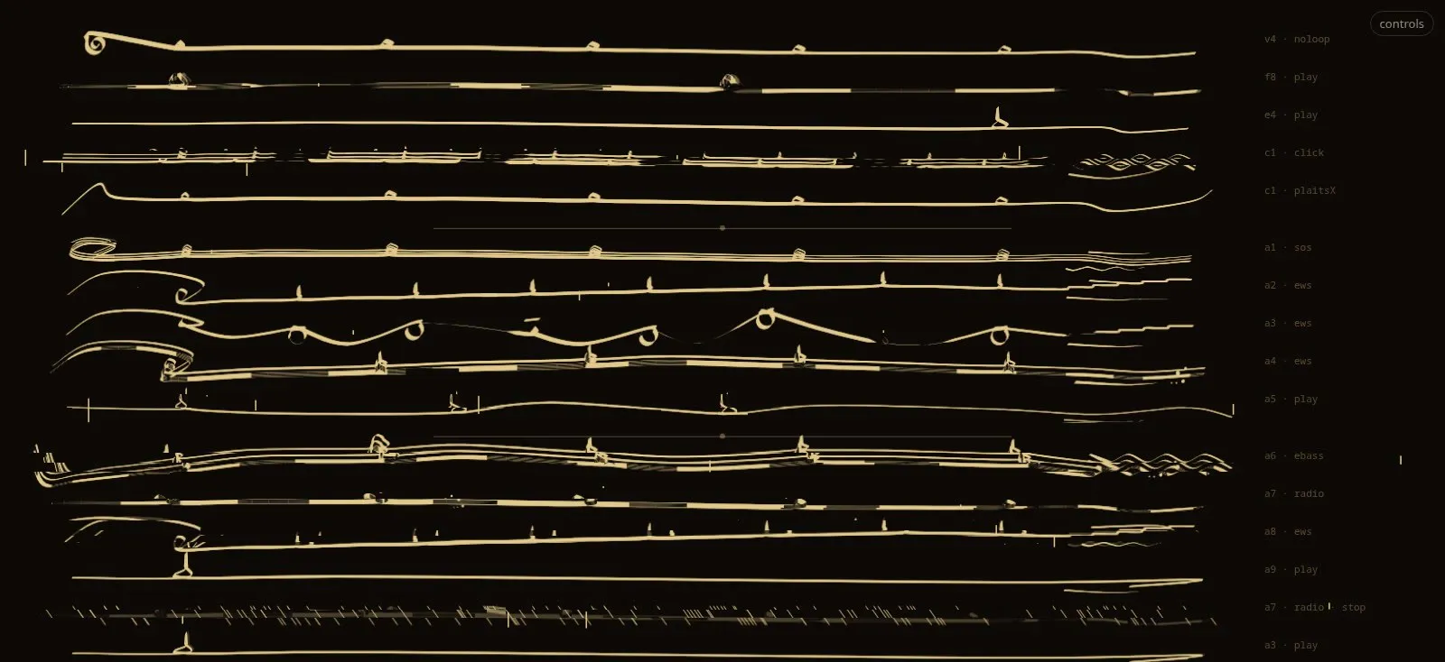
| Khipu | Andean khipu; grass-script brush | A pendant cord on the set’s main cord; knots are hits, the untied place is the rest (khipu’s zero); it hangs lower for lower octaves and thickens with level | Gestalt: time as a line, rhythm as events |
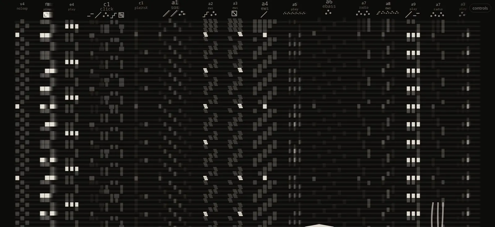
| Matrix | Hangul, Braille, dot-matrix, Jacquard cards, piano roll | A row of lit cells in fixed fields, ordered and sized by frequency in the corpus (frequent means short [26]V) | Comparison between players, at a glance |
| Calligraphy | Arabic broad nib, tughra, Nastaliq, feibai, palimpsests | A line of broad-nib calligraphy; rests are kashida; the code’s randomness and grit corrupt the line; .stop() leaves a palimpsest | Character and gesture |
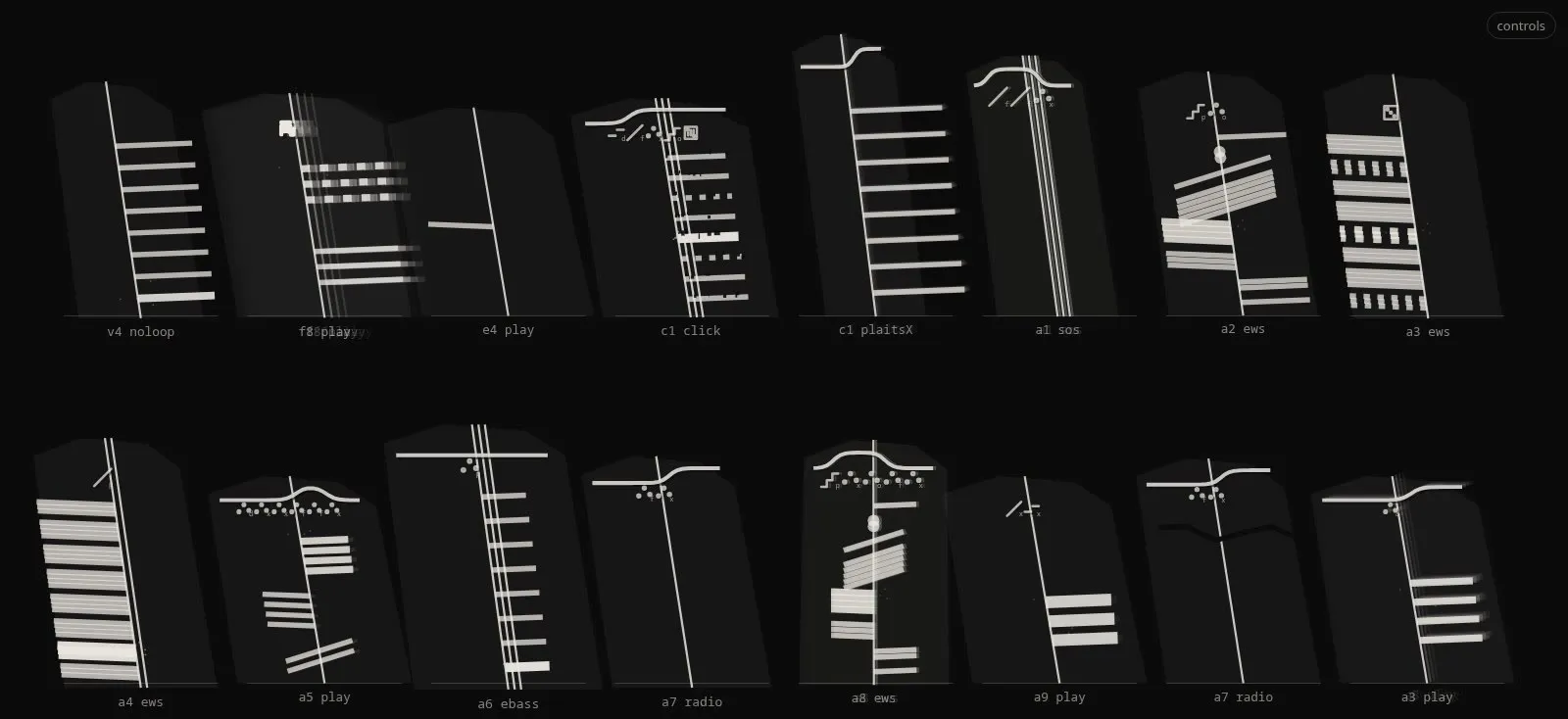
| Ogham | Ogham stones | A standing stone; each event a group of 1–5 cuts along its edge, read bottom to top; level is the cut’s length | Counts and percussion |
| Clay | Cuneiform tablets, cylinder seals | A ruled line opening with its family’s determinative; scale degrees as counts of wedges; level as depth of the press | Accumulation: the set as an account |
| Loom | Strip weaving, Jacquard | A band of warp threads; each step weaves one row, so the cloth is the set’s history; a melody makes a climbing twill | History: change over time |
| Star chart | Planispheres, asterisms | A constellation: notes are stars, loudness is magnitude, the melody is the figure; the sky turns once every 32 beats | Contour and loudness |
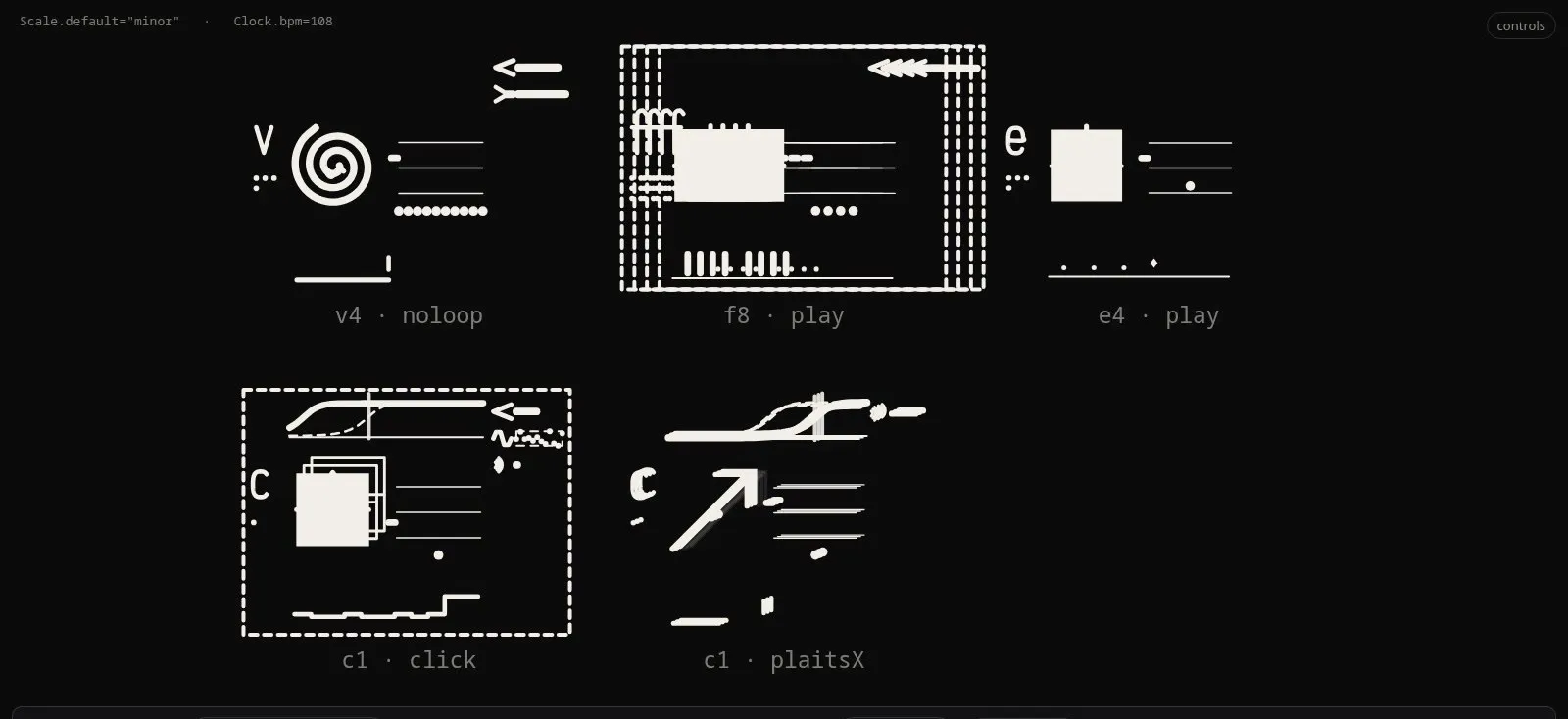
Glyph blocks
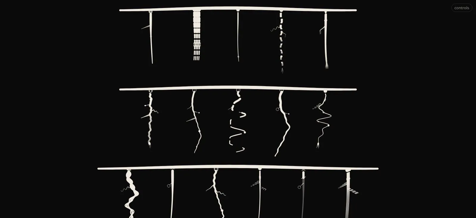
Khipu
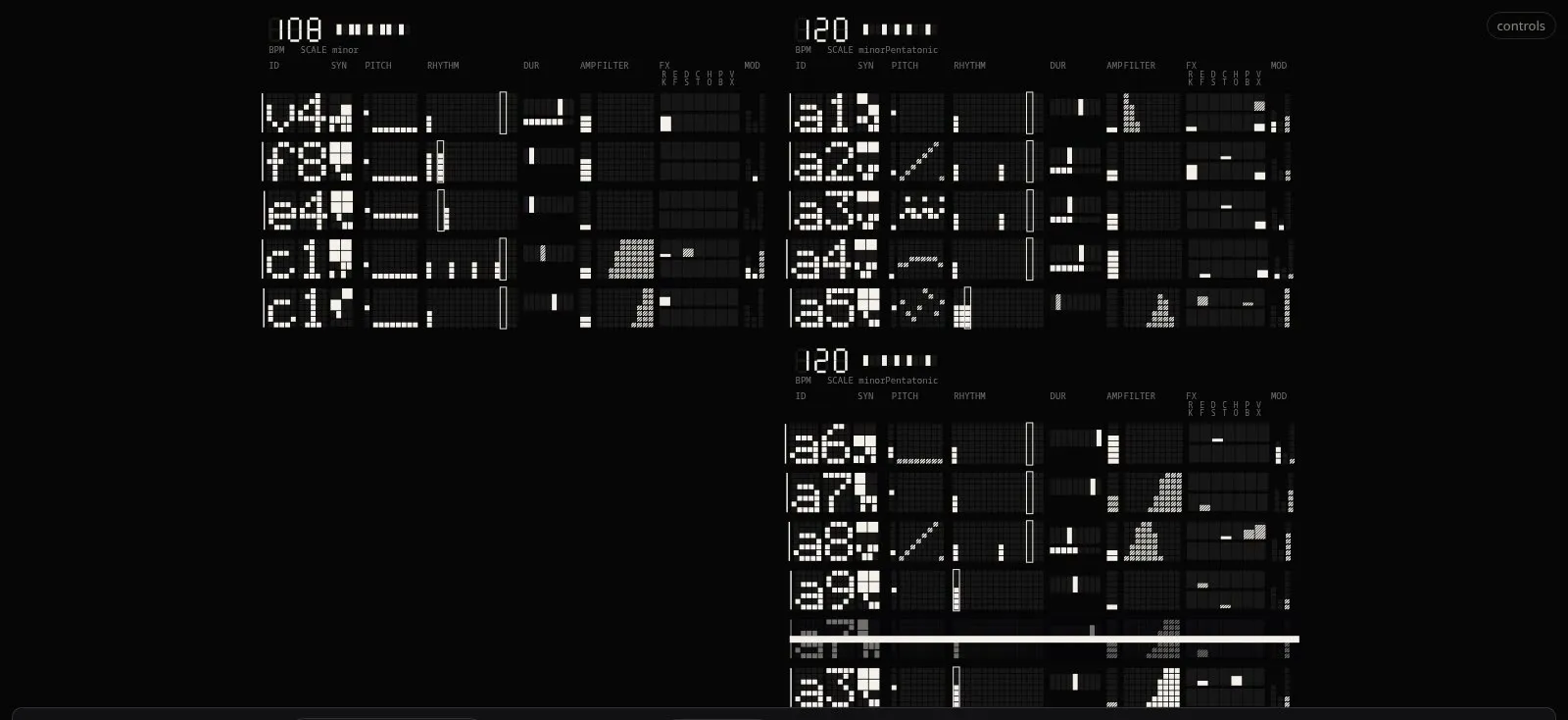
Matrix
Calligraphy
Ogham
Clay
Loom
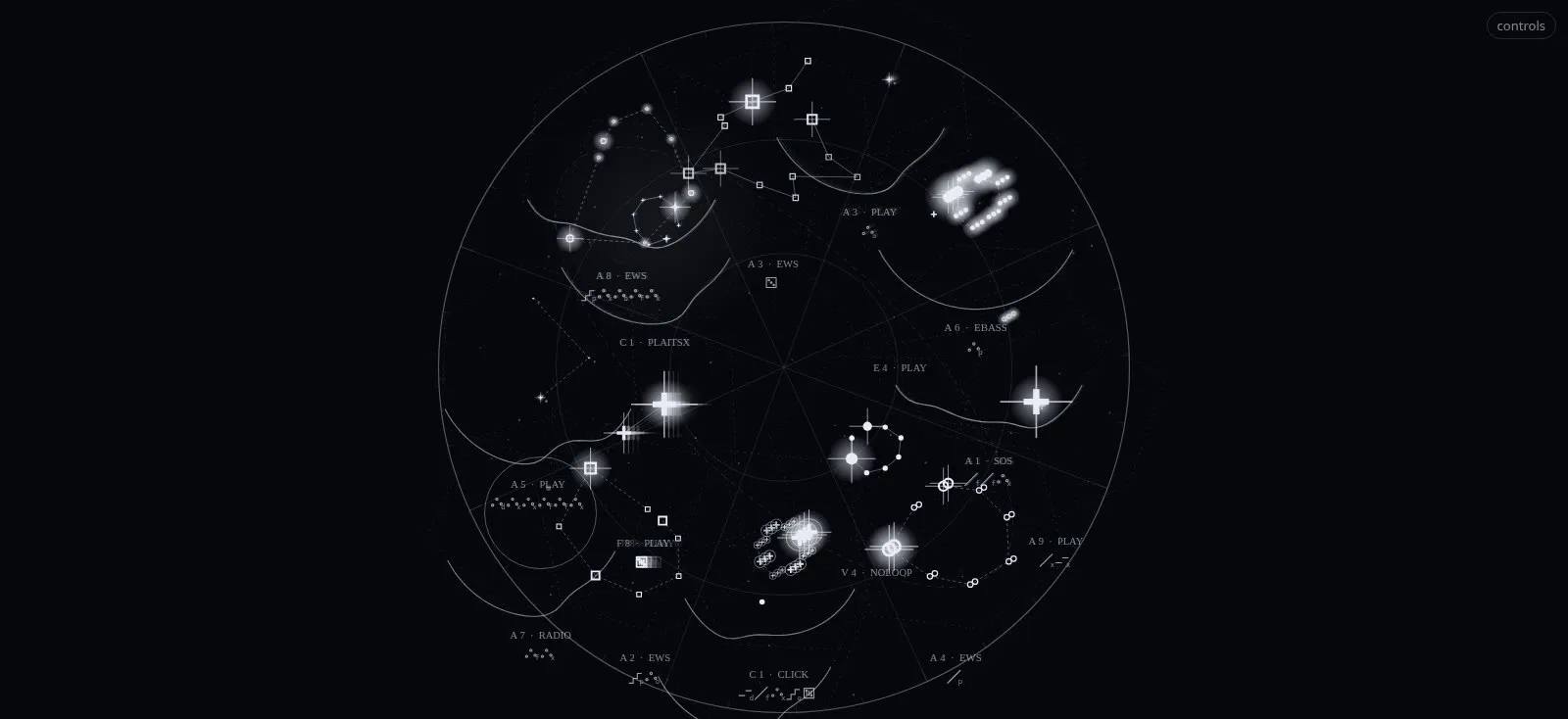
Star chart
Figure 13. #2
The three first registers form a deliberate triangle: glyph blocks are exact, khipu gestural, matrix comparative. The later five widen the range of tools and surfaces (nib, chisel, reed, loom, sky) and therefore of the qualities a performance can take on. All eight are driven by the same parse of the code and the same per-voice signals, and each reacts to every parameter of the line it draws, so that switching register mid-set changes the look without changing what is said.
7. From sound to form
Layer C and the live registers need signals: per voice, what is sounding, how loud and bright it is, and when it hits. They come from three sources, combined.
The code itself. Every evaluation is parsed (the same reader that draws the score), so each glyph knows its player’s rhythm, pitch pattern, filter, effects and how each value moves. Between evaluations the renderer can advance each player along its own patterns, in step with the clock. This makes the drawings deterministic and testable without audio, and it is what the standalone examples show.
The performance. During a show the performers’ evaluations, the tempo and named cues are relayed from the live-coding environment to the renderer, so a re-evaluated line writes itself on at the moment it is sent, and the beat-locked motion is predicted from the shared clock rather than detected (Section 5.6, rule 2).
The sound. The room’s sound (or the set’s output) is analysed for level, bands and hits. Hits matter most, because they drive the pulses. A first implementation read the spectrum once per drawn frame, which ties detection to the frame rate: heavy scenes run slower, and slow frames lose onsets. We replaced it with a detector that runs on the audio thread (an AudioWorklet) and hears every sample: three bands (kick 40–100 Hz; snare 150 Hz–5 kHz, confirmed only if a 3–7 kHz noise band rises with it, which a chord stab does not; hat above 7 kHz), a fast and a slow envelope per band, a hit at the top of a rise past a threshold in decibels (so any loudness), a floor under the band’s recent peak, and a refractory time. The detector’s source is self-contained, so the same function runs offline in the tests and on the audio thread.
We tuned it offline with a grid search, on two tracks whose hits are known exactly because we generated them: a dense mix (bass on sixteenth notes, chord stabs, pads) and a simple drum loop. Table 7 compares it with the frame-based reading it replaced. On the dense mix, the new detector finds every kick, at any loudness and with added noise; the old one found 44% at 60 frames per second and 24% at 20. In the browser, with the page held to 21 frames per second, the drum loop still gave every kick and every hat (48 of 48; the frame-based reading: 29 of 48).
Table 7. Hit detection on a dense mix with known hits (a generated 3-minute track at 128 bpm). “Found”: share of true hits detected within 15 ms before to 60 ms after; “on target”: share of detections that are true hits. The audio-thread figures are the same at −20 dB and with added noise.
| Kick | Snare | Hat | |
|---|---|---|---|
| found / on target | found / on target | found / on target | |
| Frame-based, 60 fps | 44% / 94% | 3% / — | 82% / 98% |
| Frame-based, 20 fps | 24% / — | 28% / — | 40% / — |
| Audio thread (any frame rate) | 100% / 87% | 61% / 69% | 78% / 97% |
Per voice from a mix. A room microphone hears the mix, not the voices. Per-voice signals therefore combine the code (which voice plays what, and when, from its pattern and the clock) with the analysis (whether the room confirms it, and how strongly). The bass line can swell when the bass plays because the renderer knows from the code that the bass is the voice on that beat and in that bandH.
The stage. In performance the registers are not shown alone. They are areas of a larger canvas through which a camera travels during the set, alongside other visual material, and the same signals (tempo, cues, hits) can drive the camera and the other areas through patchable connections. That stage is outside the scope of this paper; what matters here is that the scripts were designed to be read in it, at distance, for seconds at a time, while the camera moves.
8. What has been measured, and what has not
This is a design paper, and most of its claims are hypotheses. We separate what was measured from what remains to be tested.
8.1 Measured
- The corpus (Table 2): character, key, function and method counts over 218 sets. These set the font’s priorities (digits and punctuation first) and the order and size of the matrix register’s fields.
- Ink operators at 10 pt, nominal and after a simple dot-gain model: LIGHT 68%, FW 61%, BONE 46% of the solid ink; hollow and scanline treatments 67–95% after gain, depending on the printer.
- Complexity: Scriptorium measures each glyph’s perimetric complexity, so the complexity budget of Radix, the invented scripts and the player glyphs can be checked while designing.
- References: two audits checked 33 and 38 sources against their abstracts; three claims were removed and nine corrected before any design depended on them.
- Hit detection (Table 7), and the renderer’s ability to run at stage frame rates.
- Parser coverage: all 218 sets of the corpus parse, with on average 13.5 voices per file; the score is drawn from a full set in about 0.3 s.
8.2 Not yet tested
The questions that decide whether the design works for readers are open. The project formulated them as 36 experiments (Appendix A). The most important for this paper are:
- Legibility at distance (X16, X25): how large must code be in our venues, at equal projected x-height, and is the codex of glyphs read faster than plain code in one-second glances (“how many drum players?”, “which player stopped?”)?
- Projection gain (X17): how much does bloom close gaps, black-on-white versus white-on-black?
- Do the signs help (X18), and do the live axes read as sound (X19: “which line is loudest?”, “brightest?”)?
- Learnability (X23, X24, X26): can a one-night audience learn the nine family radicals with ruby in a few minutes, and read the affixes? Is the reduced Grass register enough at 20 m?
- Iterated learning (X27): which parts of the glyph survive when learners redraw it from memory? The survivors become the Grass register [16]V.
9. Discussion
Why code suits meaningful writing better than English. Weft on English depends on an analyser that guesses parts of speech, phrases and meaning classes, and every wrong guess is a visible error; the project’s own rule was to show no mark when unsure. Code removes the guess: a parser knows exactly which token is a player, a synth, a key or a pattern. The closed vocabulary also keeps the sign inventory small enough to learn. The same mechanisms that would be a burden on prose become cheap and exact on code. This is, we think, the paper’s central observation, and it deserves testing on other live-coding languages.
Legibility versus spectacle. The project’s recurring lesson is that aesthetics is part of the semantics: round reads soft and angular sharp whether we intend it or not [6]V. A wall of beautiful but unreadable code fails the premise of showing the screen; a readable but dull one fails the stage. The layered design is our answer: the performer’s screen gets the still, legible layers, and the wall gets motion and registers chosen for the moment of the set. Whether audiences read the signs, or only see them, will decide how much of the design is notation and how much is image.
Learning and conventionalisation. Scripts simplify with use, and signs that evolve inside a group become unreadable to outsiders [14]V. A live-coding audience is a group that changes every night. The script must therefore stay anchored to its full forms (Kai, glyph blocks), with simplified registers derived by rule, not by drift.
Limitations.
- The evidence base is mostly about reading prose, in alphabetic scripts, at reading distance; its transfer to code on a wall is assumed, not shown. Reading research is also strongly Anglocentric [31]V.
- The corpus is ours: one group’s style of writing FoxDot, which may exaggerate the closedness of the vocabulary.
- Several design choices rest on secondary or background sources, tagged as such; some (the size of the printed area readers use) were removed from the evidence after the audit.
- The hit detector was tuned on generated tracks only.
- No reader study has yet been run.
Accessibility. Beat-synced pulses at 120–180 bpm run at two to three per second, near the threshold that photosensitivity guidance treats as hazardous [36]S; the design pulses weight rather than full-screen luminance, and flashes on the bar rather than the beat. Older and low-vision readers are hurt most by thin strokes, and dyslexic readers may be hurt by added marks and texture: every layer of the font has an off switch. Colour is never the only cue (for two performers, two pens rather than two colours).
10. Conclusion
Writing is a technology with many possible designs, and live-coded music is a text unlike prose: small, closed, regular, numeric and punctuated, written once and read by many at distance while it sounds. We have argued that such a text deserves the devices that writing systems invented for similar situations (classifiers, logograms, featural signs, compound blocks, registers) and shown one way to apply them: a three-layer font for the code itself, and a player script that writes each line as one glyph, in eight registers that share one grammar. Every design decision carries its evidence status, and most remain hypotheses. The next step is to put them in front of readers: in the rehearsal space at 10 and 20 metres, and in the room during a set.
Appendix
A. The planned experiments
All experiments share one standard: counterbalanced order, readers of varied ages and vision, effect sizes with confidence intervals, comparisons at equal x-height; where print matters, sizes of 8, 10 and 12 pt on two printers and two papers; where projection matters, several distances and projectors.
| ID | Question | Method |
|---|---|---|
| Ink-saving type | ||
| X1 | FW versus LIGHT at equal ink | Reading speed and errors at 8 and 10 pt |
| X2 | Scanline gap width versus dot gain | Calibration sheet; weighing printed sheets |
| X3 | Does restoring terminals cut letter confusions? | Letter confusion matrix |
| X4 | Printer toner-save × low-ink font | 2×2 design |
| Weft and Radix | ||
| X5 | Do Weft meaning marks give a preview of meaning before fixation? | Eye tracking, boundary paradigm |
| X6 | Meaning mark over the first letter versus after the word | Same paradigm |
| X7 | Semi-joined versus fully joined base hand | Lexical decision and sentence reading |
| X8 | Logogram learning curve | Reading speed over five sessions |
| X9 | Affix marking: tint versus raised versus none | Masked priming and reading speed |
| X10 | Radix transfer to untrained compounds | Teach 20 primitives, test 40 new compounds |
| X11 | Radix rule-based versus free placement | Accuracy of meaning inference |
| X12 | Does form that matches meaning help? | Congruence task (round/soft, angular/sharp) |
| X13 | Does Radix time direction depend on the reader’s script? | Left-to-right versus right-to-left readers, standard versus mirrored edition |
| X14 | Iterated learning of Radix | Chains of learner pairs |
| X15 | Handwriting versus viewing when learning Radix | Recognition and mirror discrimination after training |
| The live-coding font | ||
| X16 | How big must code be in our venues? | Reading tests at 5, 10, 20 m, equal x-height, plain monospace versus Layer A |
| X17 | Projection gain | Calibration sheet projected black-on-white and white-on-black, photographed |
| X18 | Do the signs help? | Corpus lines with and without Layer B in 1 s glances: “which player is the bass?”, “what just changed?” |
| X19 | Do the live axes read as sound? | Clips with one mapping on: “which line is loudest / brightest?” |
| X20 | Cascade versus wrap | Long lines cascaded by structure versus wrapped; comprehension at distance |
| X21 | Rhythm notation | Learn the rhythm signs in 5 minutes; match heard patterns to typeset strings |
| X22 | Audience | After-show questions: did the code help you follow the set? Which signs did you understand? |
| The player script | ||
| X23 | Radical learnability | Teach the nine family radicals with ruby for 3 minutes; name the family of unseen synths |
| X24 | Affix reading | Pairs of glyphs from real code: “which is brighter, faster, more distorted, louder?” |
| X25 | Glyph versus text at distance | 10 m, 1 s glances: codex versus plain code versus Layer B letters |
| X26 | Kai versus Grass | Full block versus main sign plus one affix, at 10 and 20 m |
| X27 | Iterated learning | Learners redraw glyphs from memory; the survivors form the Grass register |
| X28 | Are the khipu’s iconic mappings read without a key? | Two cords: which is louder, lower, brighter, busier, has more reverb? |
| X29 | Gist at distance | 1 s glance at 10 and 20 m: “how many players?”, “which one stopped?” Khipu versus blocks versus text |
| X30 | Preference with and without motion | Ratings of the wall still versus live |
| X31 | Learning the matrix codes | Name the family from the synth field after rehearsal-time learning |
| X32 | Column reading | “Which player is loudest / brightest?”: matrix column versus glyph blocks versus khipu, timed |
| X33 | Register preference by role | Performers and audience rate registers for following the set and for stage look |
| X34 | Is corruption read as randomness? | Same player with and without random functions: “which is more random?” |
| X35 | Rhythm from letterforms | Count hits in a calligraphic line versus a matrix row, at 10 m |
| X36 | Register by section | Ratings of registers against intro, build, peak and outro |
References
- Herman Bouma. 1970. Interaction effects in parafoveal letter recognition. Nature.
- Karen Burland, Alex McLean. 2016. Understanding live coding events.
- Cornelius Cardew. 1963–1967. Treatise.
- Li-Yun Chang, David C. Plaut, Charles A. Perfetti. 2016. Visual complexity in orthographic learning across 131 scripts.
- Mark A. Changizi et al. 2006. The structures of letters and symbols throughout human history are selected to match those found in objects in natural scenes.
- Christine Cuskley, Julia Simner, Simon Kirby. 2017. Phonological and orthographic influences in the bouba–kiki effect.
- Stanislas Dehaene et al. 2005. The neural code for written words: a proposal.
- Connor Diemand-Yauman, Daniel M. Oppenheimer, Erikka B. Vaughan. 2011. Fortune favors the bold (and the italicized): effects of disfluency on educational outcomes. Cognition.
- Daniel Fiset, Caroline Blais, Catherine Éthier-Majcher, Martin Arguin, Daniel Bub, Frédéric Gosselin. 2008. Features for identification of uppercase and lowercase letters. Psychological Science.
- Daniel Fiset et al. 2009. Follow-up study on the features used to identify uppercase letters.
- Ram Frost. 2012. Towards a universal model of reading.
- Orly Fuhrman, Lera Boroditsky. 2010. Cross-cultural differences in mental representations of time.
- Doreen R. Fuller. 1997. Translucency and complexity in learning Blissymbols.
- Simon Garrod et al. 2007. Foundations of representation: where might graphical symbol systems come from?.
- Piers Kelly et al. 2021. The simplification of the Vai script over two centuries.
- Simon Kirby, Hannah Cornish, Kenny Smith. 2008. Cumulative cultural evolution in the laboratory.
- Ryan Kirkbride. FoxDot: live coding with Python and SuperCollider.
- Gordon E. Legge, Denis G. Pelli, Gary S. Rubin, Mary M. Schleske. 1985. Psychophysics of reading I. Normal vision. Vision Research.
- Gordon E. Legge, Charles A. Bigelow. 2011. Does print size matter for reading? A review of findings from vision science and typography. Journal of Vision.
- Clive Lewis, Peter Walker. 1989. Typographic influences on reading.
- Suvir Mirchandani. 2014. Typeface and ink cost. Journal for Emerging Investigators.
- Olivier Morin. 2018. Spontaneous emergence of legibility in writing systems: the case of orientation anisotropy.
- Denis G. Pelli et al. 2006. Feature detection and letter identification.
- Denis G. Pelli, Katharine A. Tillman. 2008. The uncrowded window of object recognition. Nature Neuroscience.
- Manuel Perea, Stephen J. Lupker. 2003. Transposed-letter effects.
- Steven T. Piantadosi, Harry Tily, Edward Gibson. 2011. Word lengths are optimized for efficient communication.
- Kathleen Rastle et al. 2004. Morpho-orthographic segmentation (corner as corn + er).
- Keith Rayner et al. 2011. Length and predictability effects on skipping and fixation times.
- Keith Rayner, Elizabeth R. Schotter. 2014. Semantic preview benefit in reading English.
- Claude E. Shannon. 1951. Prediction and entropy of printed English. Bell System Technical Journal.
- David L. Share. 2008. On the Anglocentricities of current reading research and practice.
- J. S. H. Taylor, Matthew H. Davis, Kathleen Rastle. 2017. Systematic mappings beat arbitrary ones in learning a new script.
- TOPLAP. The TOPLAP manifesto (“show us your screens”).
- Virginie van Wassenhove et al. 2007. Temporal window of integration in auditory–visual speech perception.
- Carlos Velasco et al. 2015. Round and angular typefaces and taste.
- W3C. Web Content Accessibility Guidelines 2.1, success criterion 2.3.1 (three flashes or below threshold).
- Randall Walker et al. 2007. Visual-syntactic text formatting. IEEE International Professional Communication Conference.
- Xiaolu Wang et al. 2017. Semantic radicals in Chinese character recognition.
Credits
- Crash Server